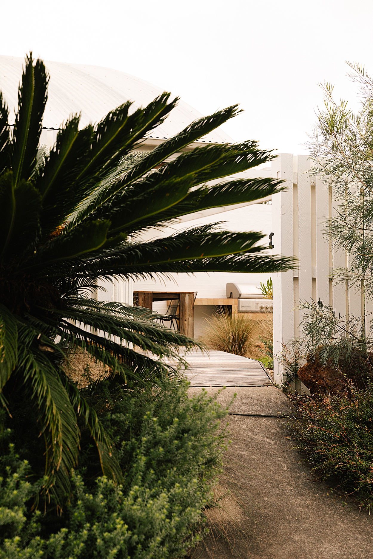
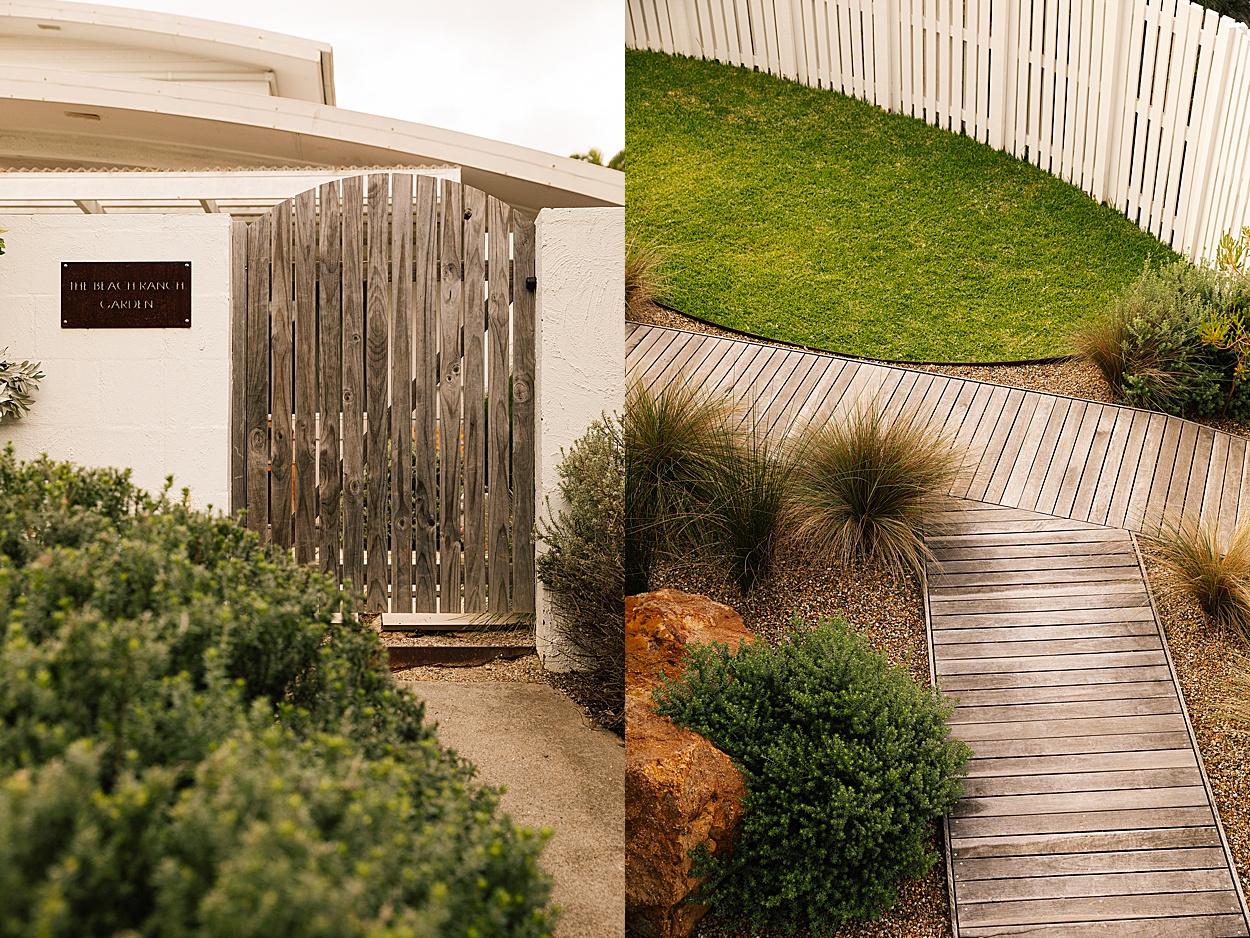
For our latest stay feature, we visited The Beach Ranch, nestled in the serene beauty of Angourie. This property seamlessly blends Australian and Californian aesthetics, surrounded by stunning beaches and abundant nature.
Drawing from her rich experiences in California, Abrabella McIntosh designed The Beach Ranch with a focus on natural materials, vintage treasures, and custom touches. Each element, from the thoughtfully sourced mid-century pieces to the carefully selected natural finishes, reflects her attention to detail.
You can feel the thought behind every aspect, creating a harmonious and inviting retreat that perfectly captures the essence of relaxation.
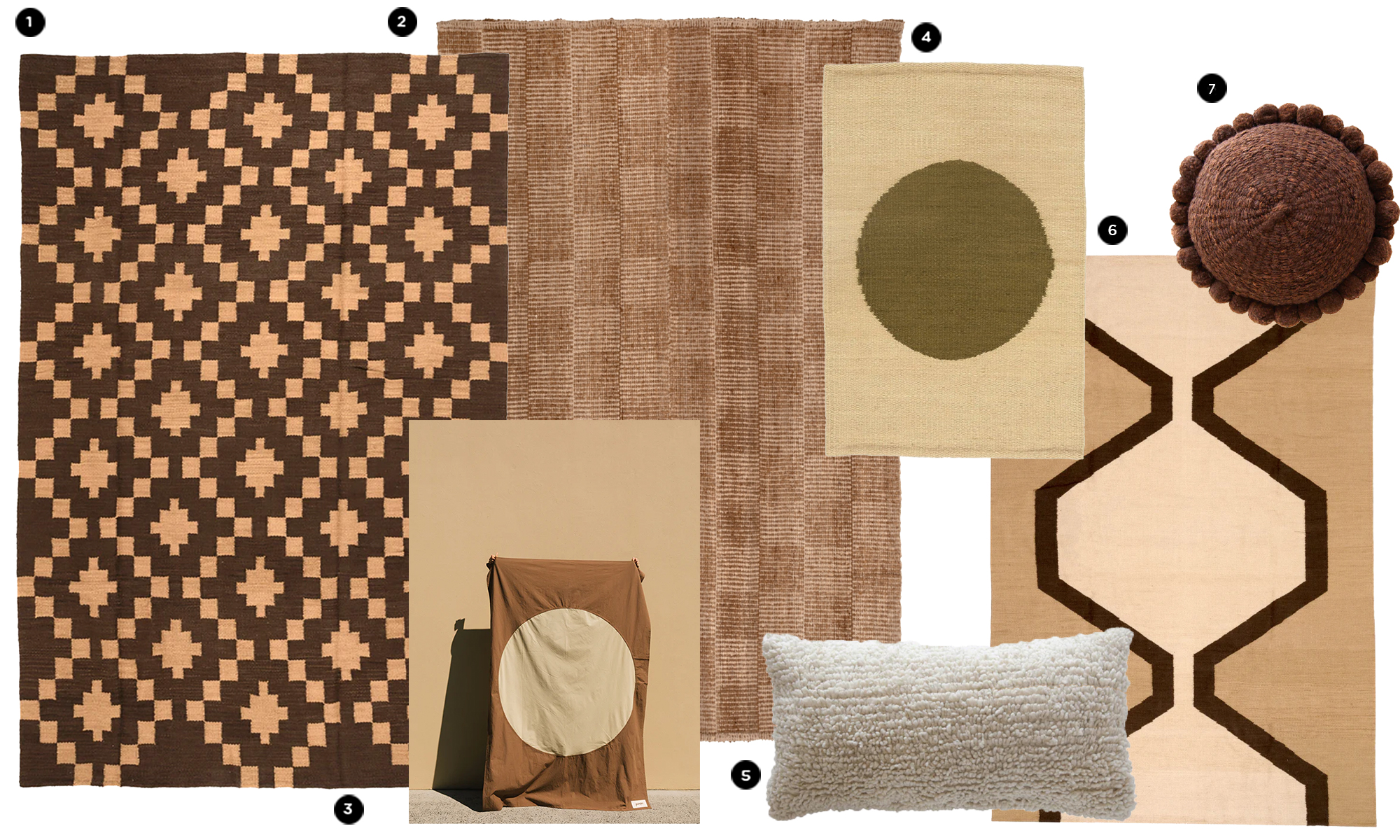
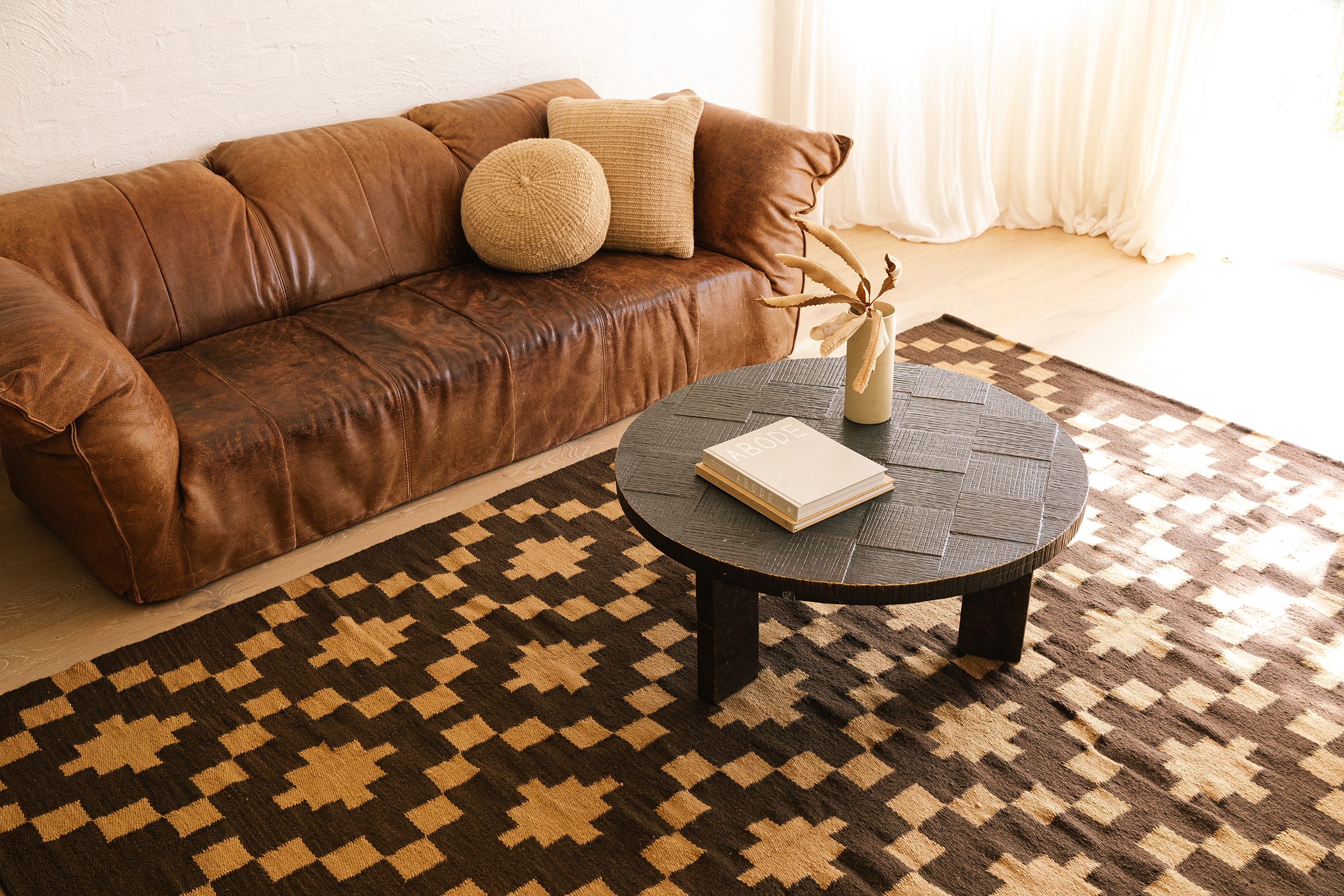
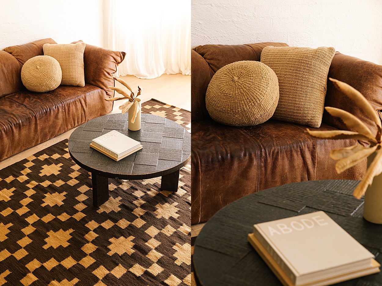
SHOP THE LOOK
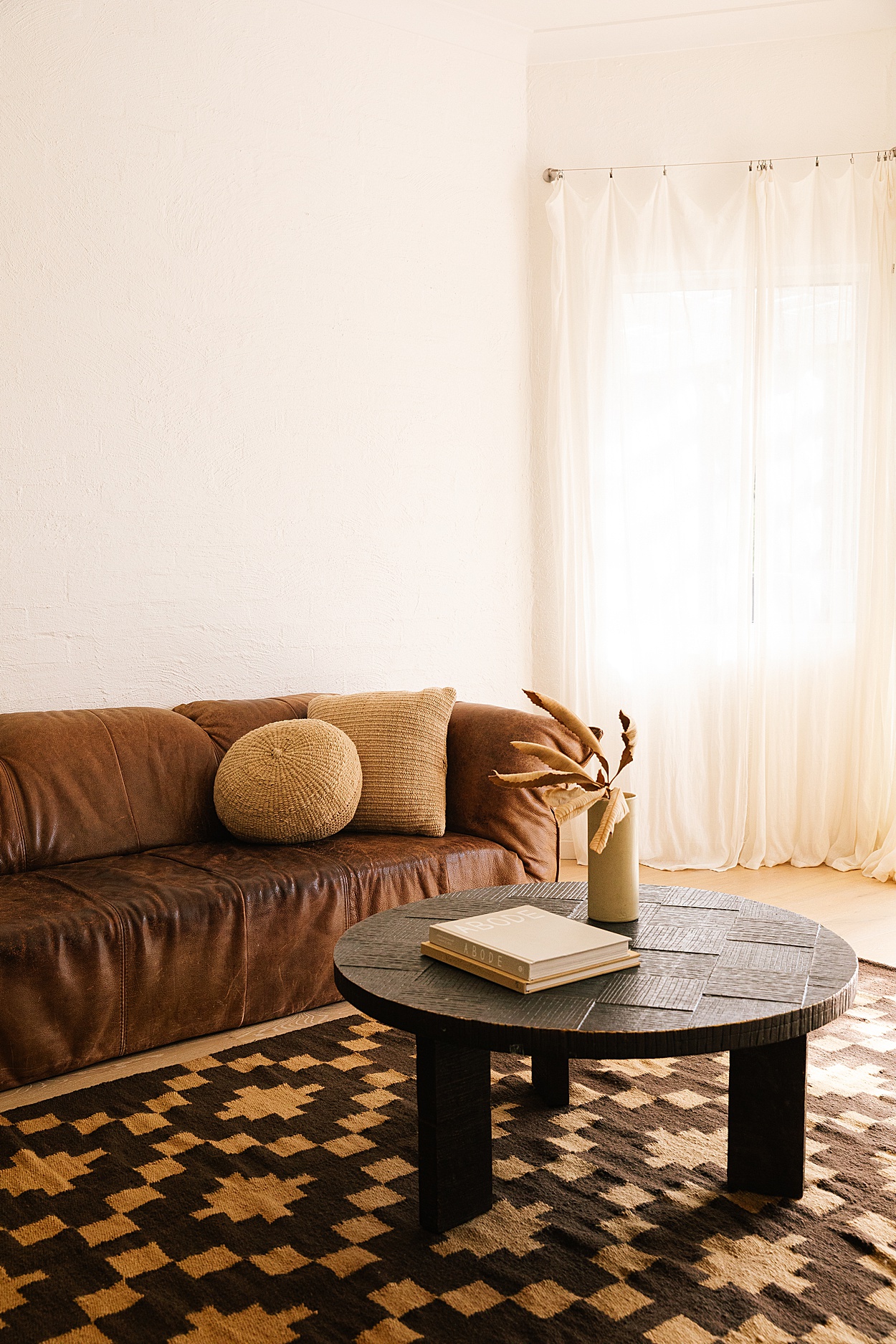
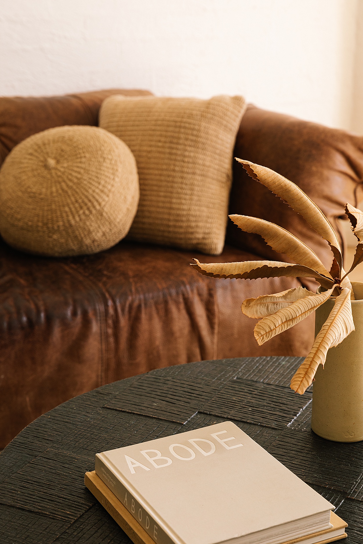
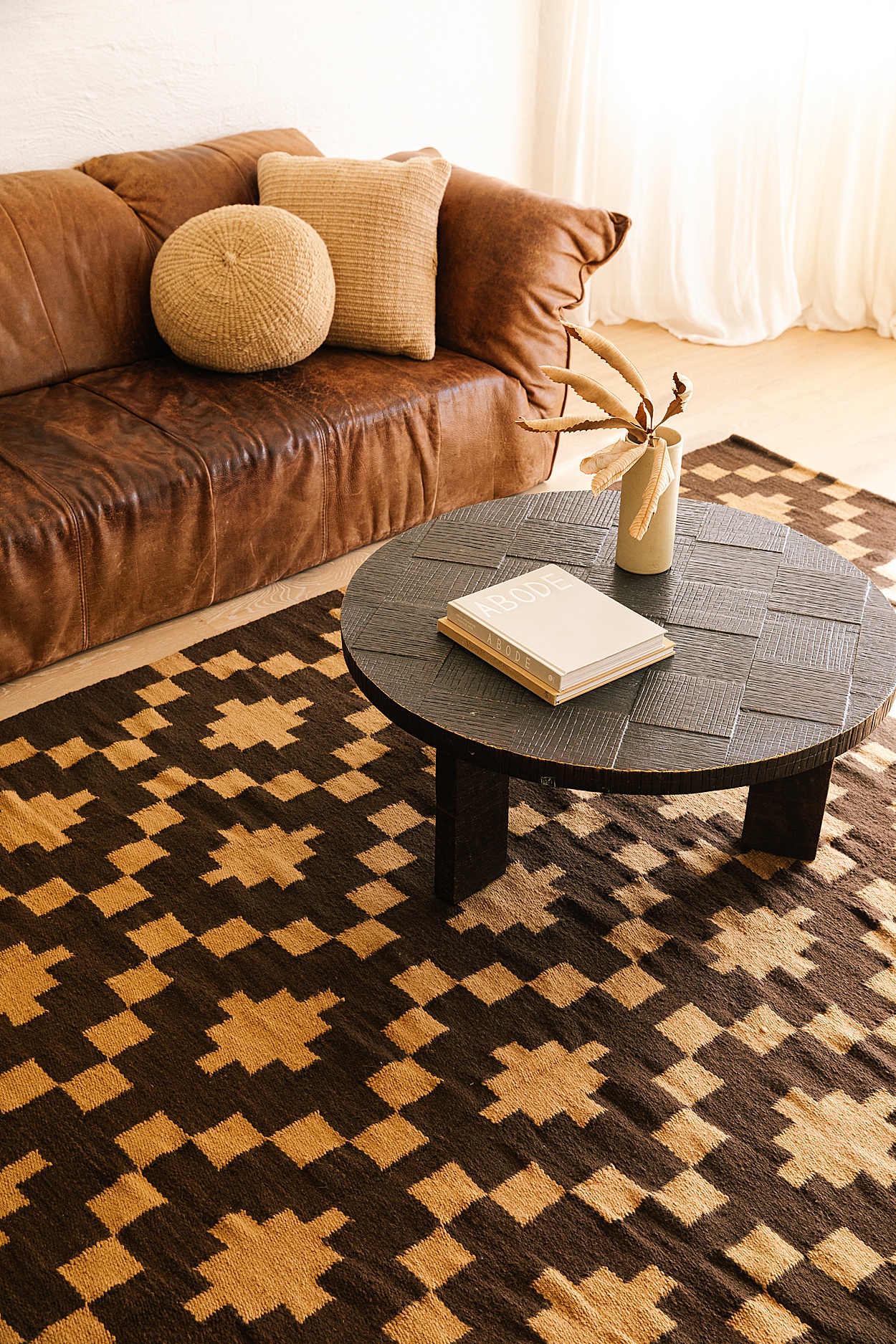
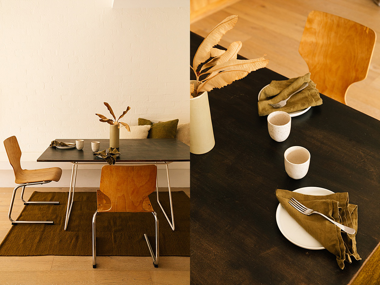
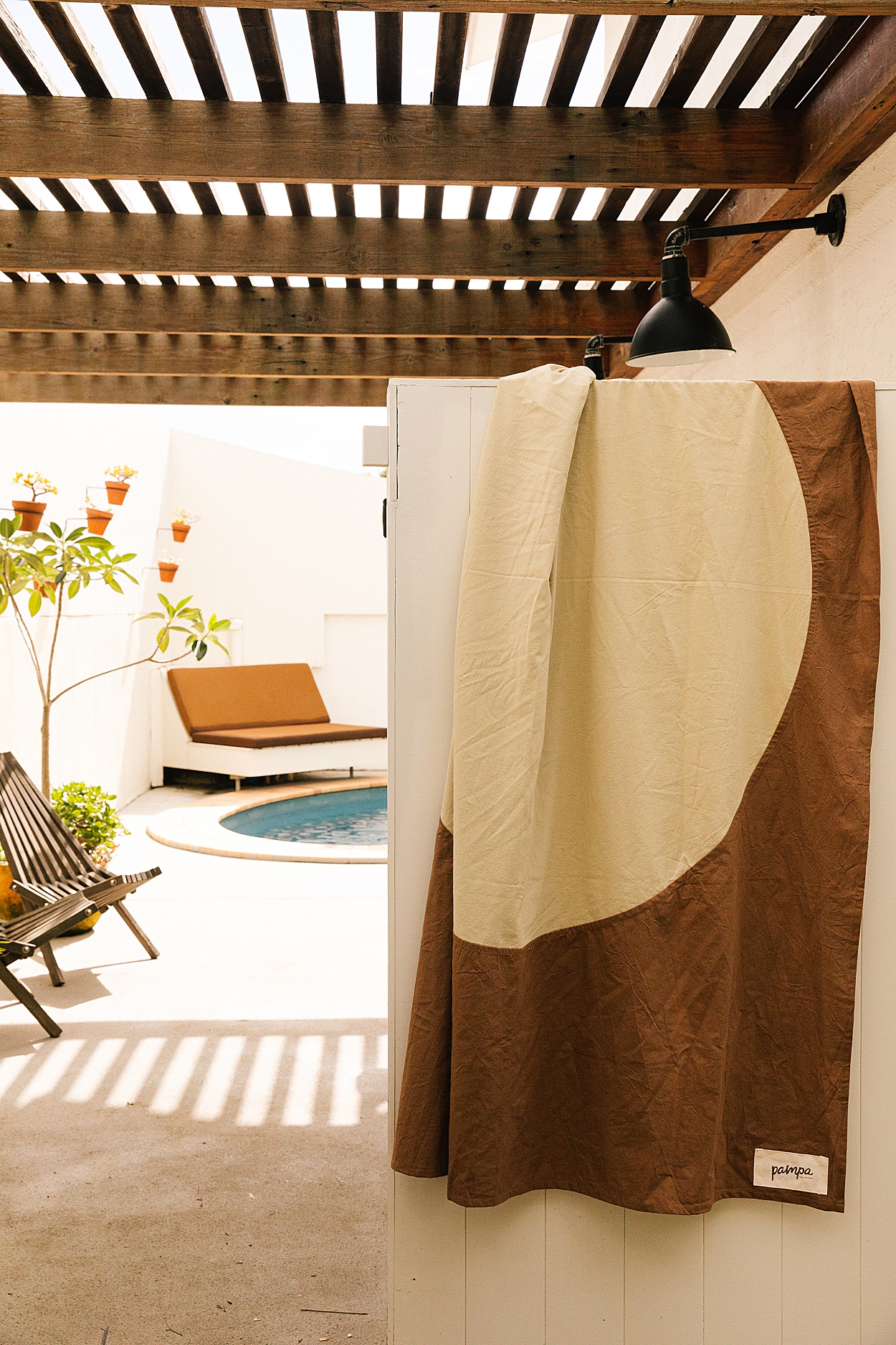
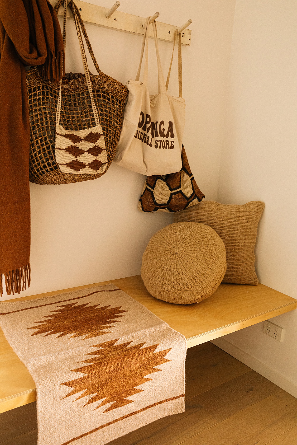
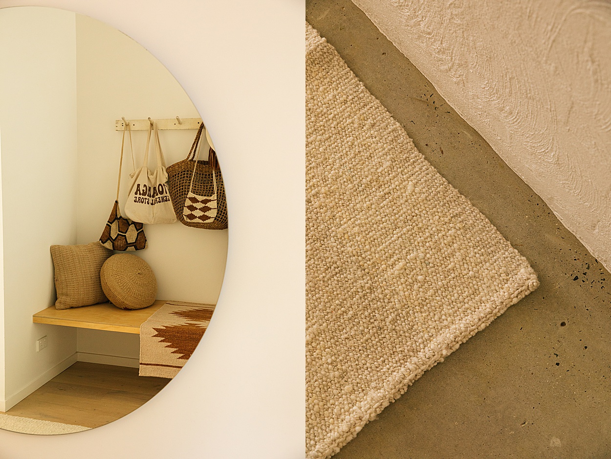
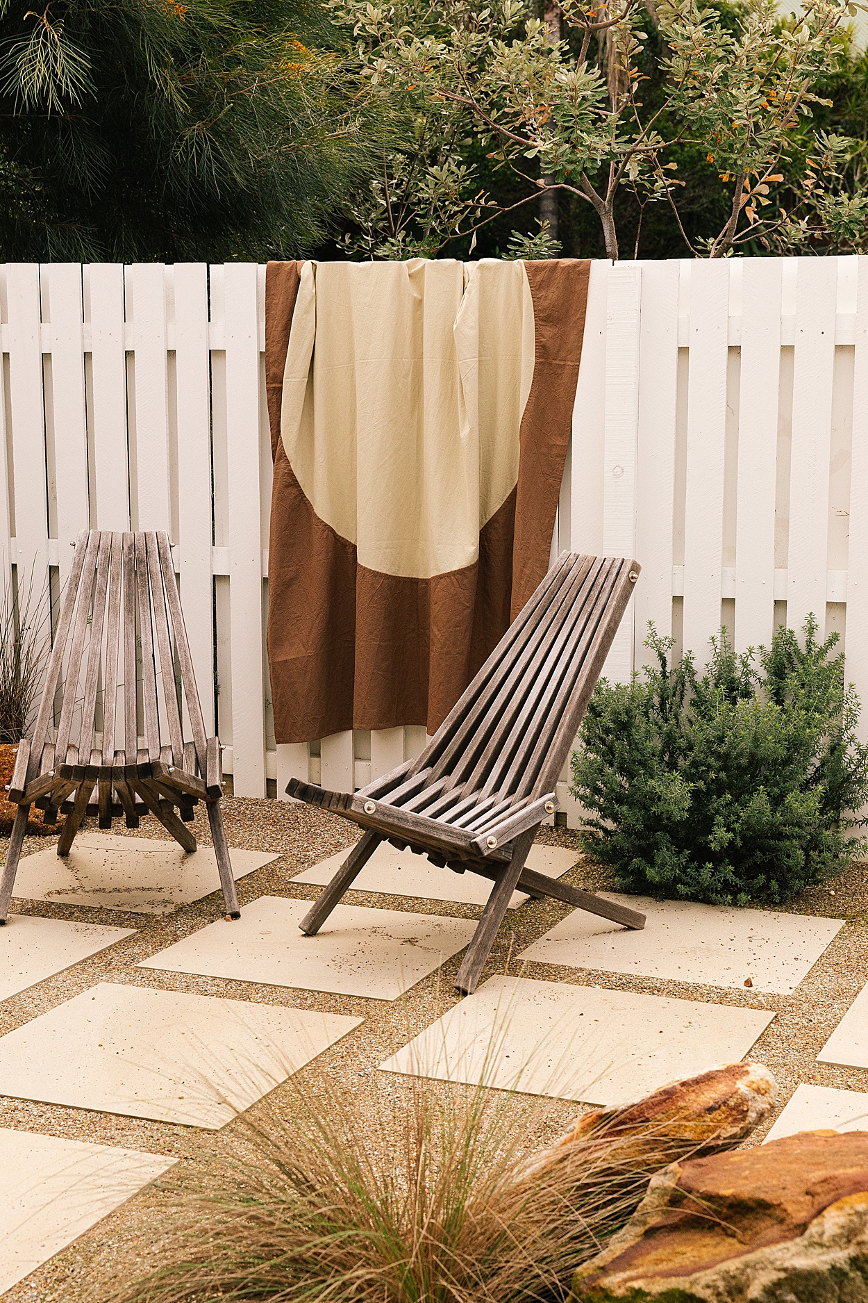
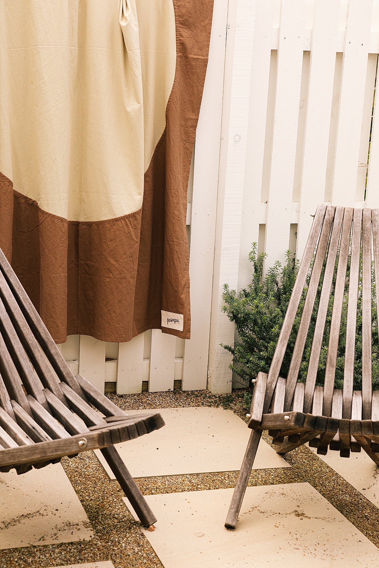
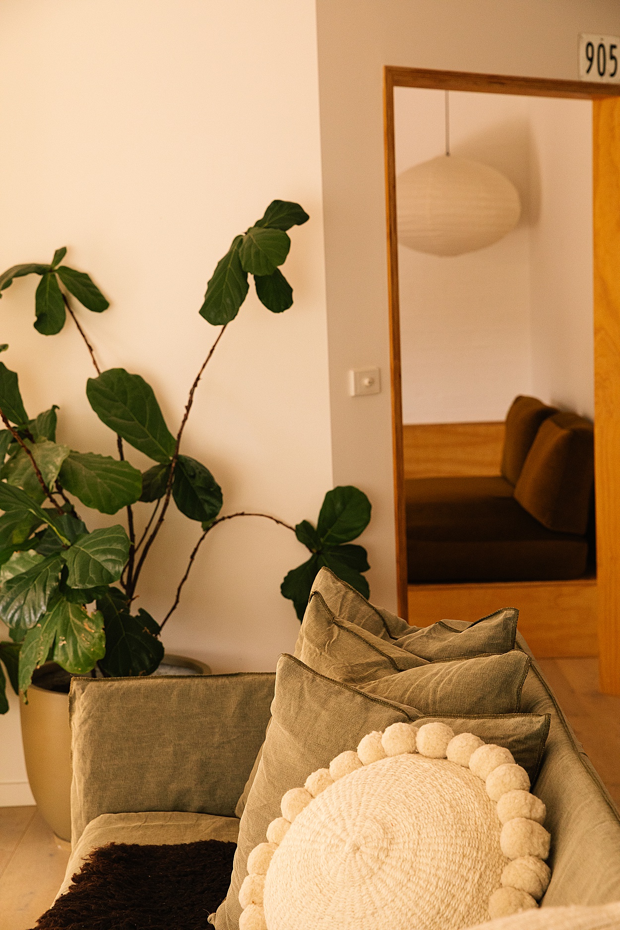
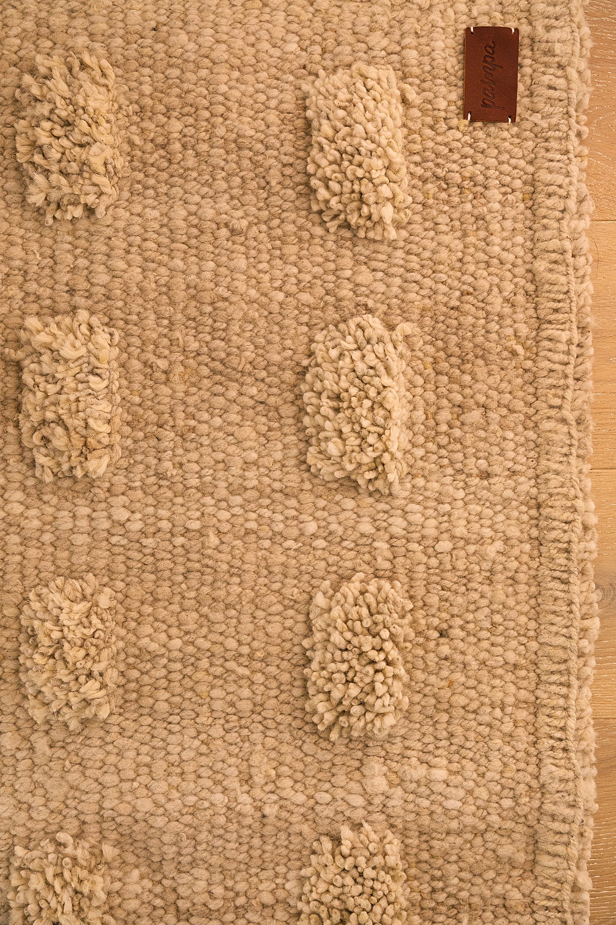
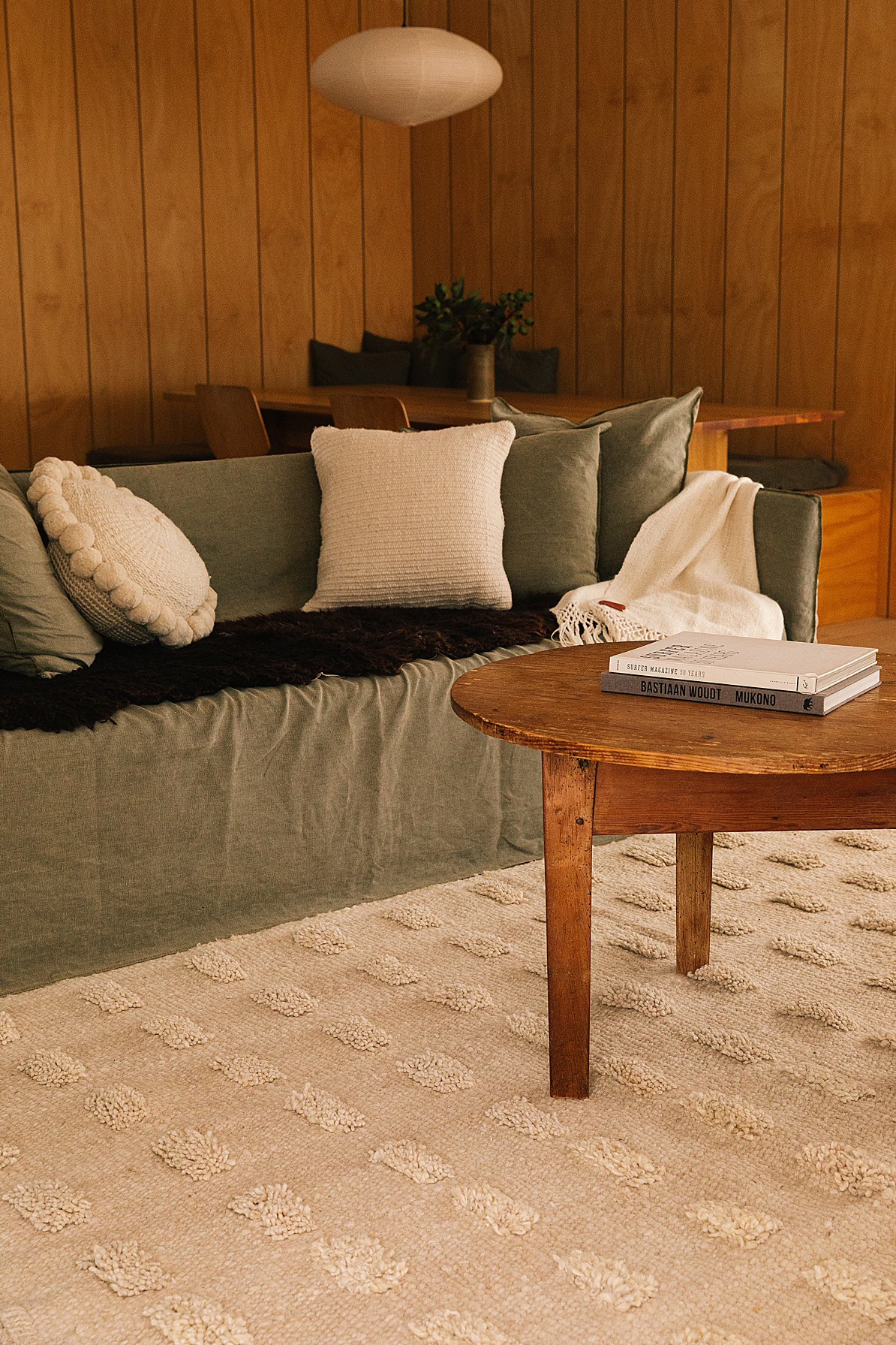
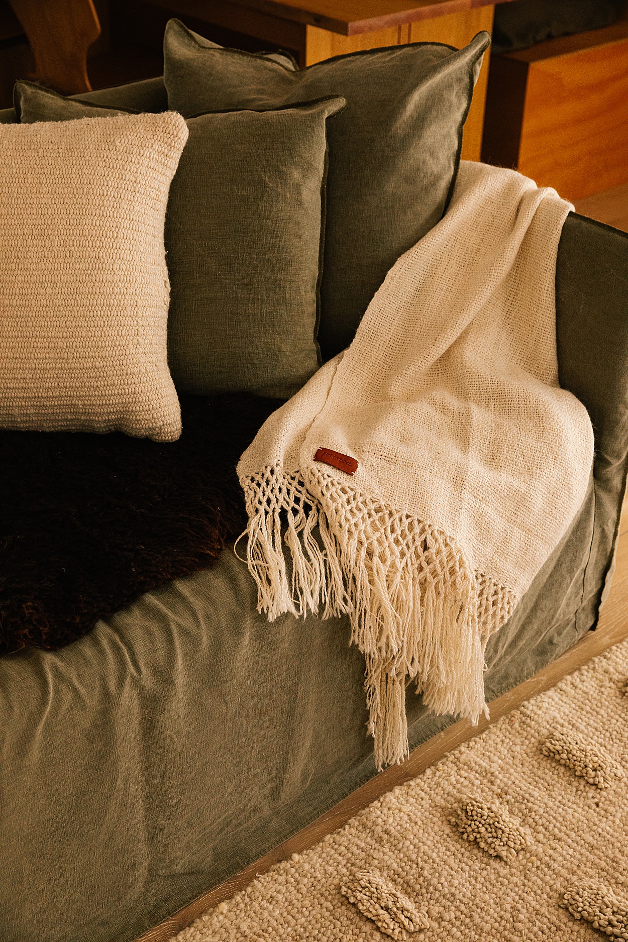
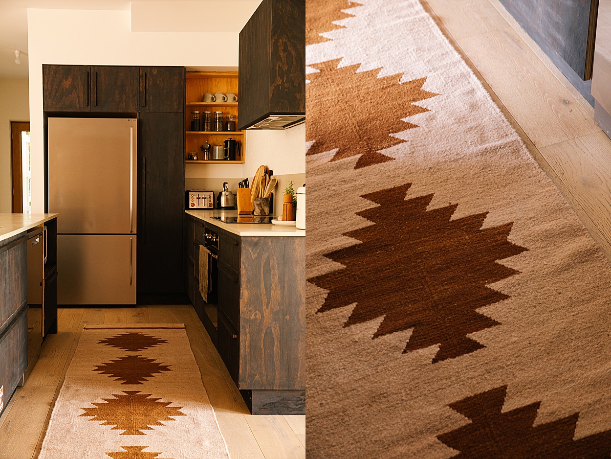
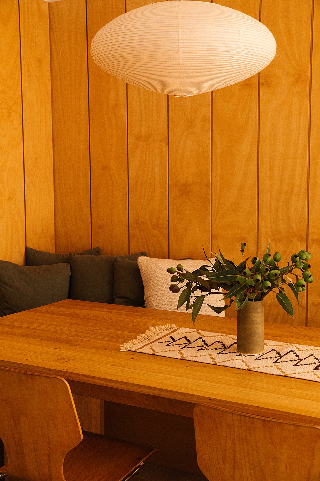
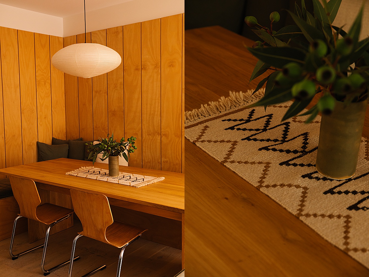
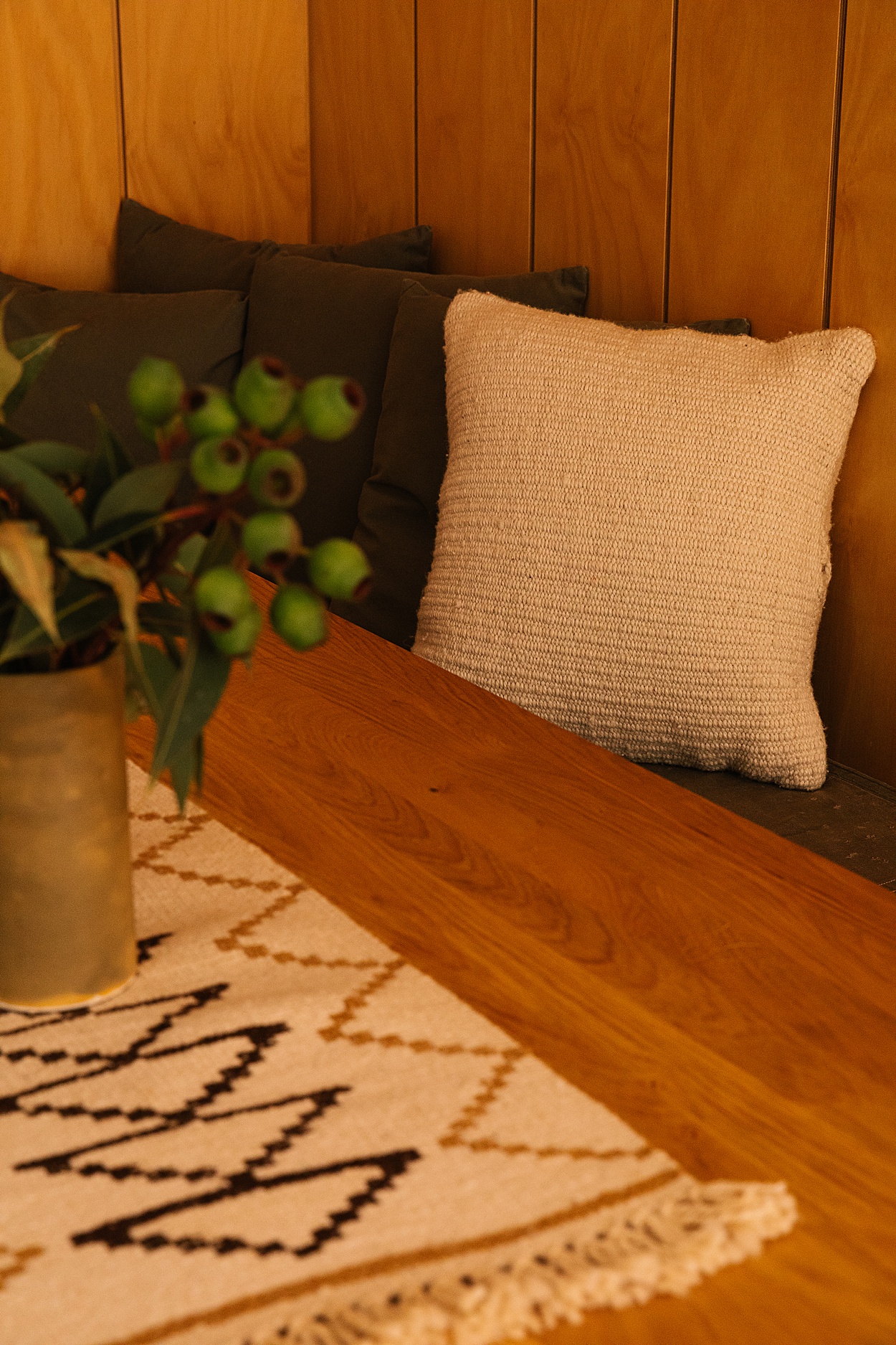
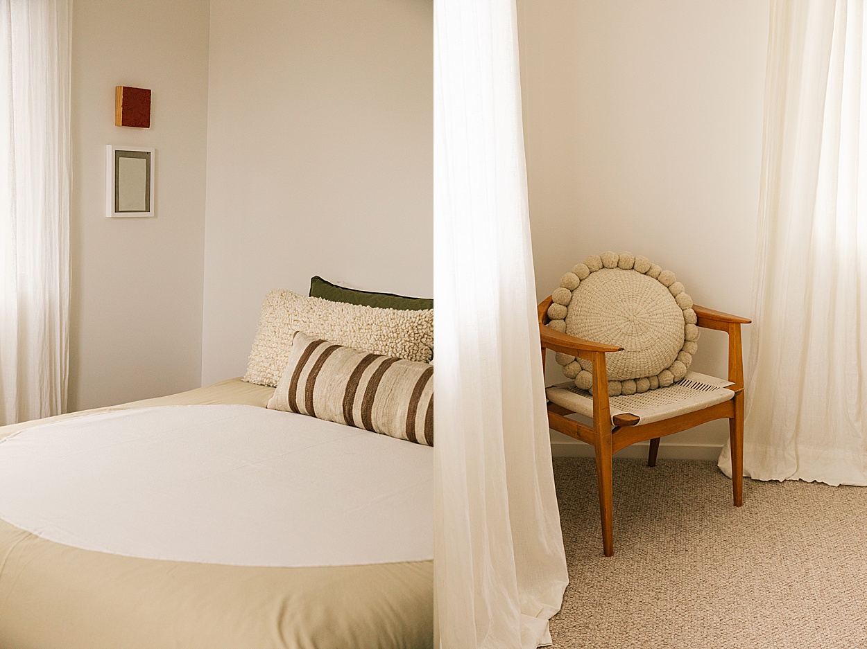
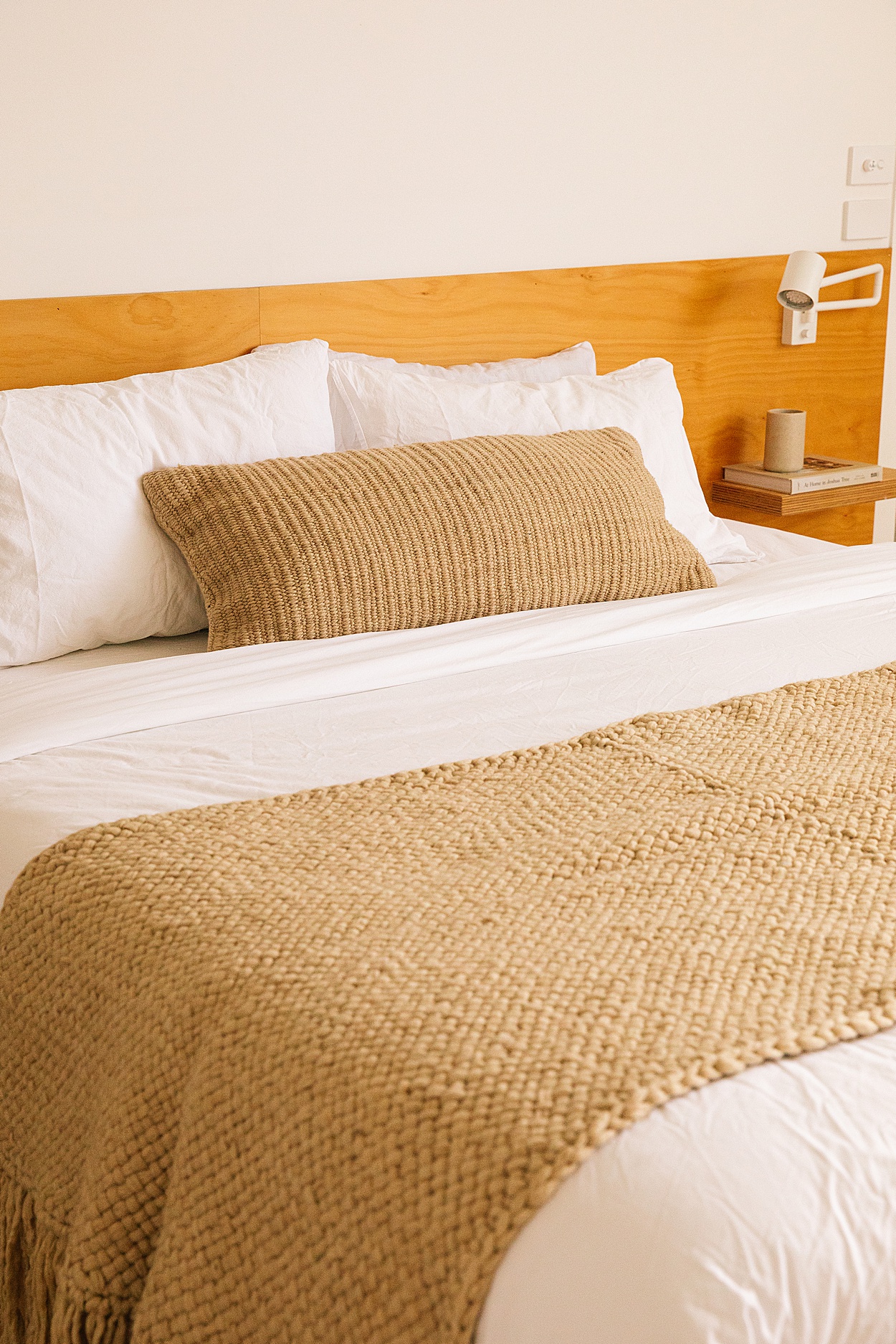
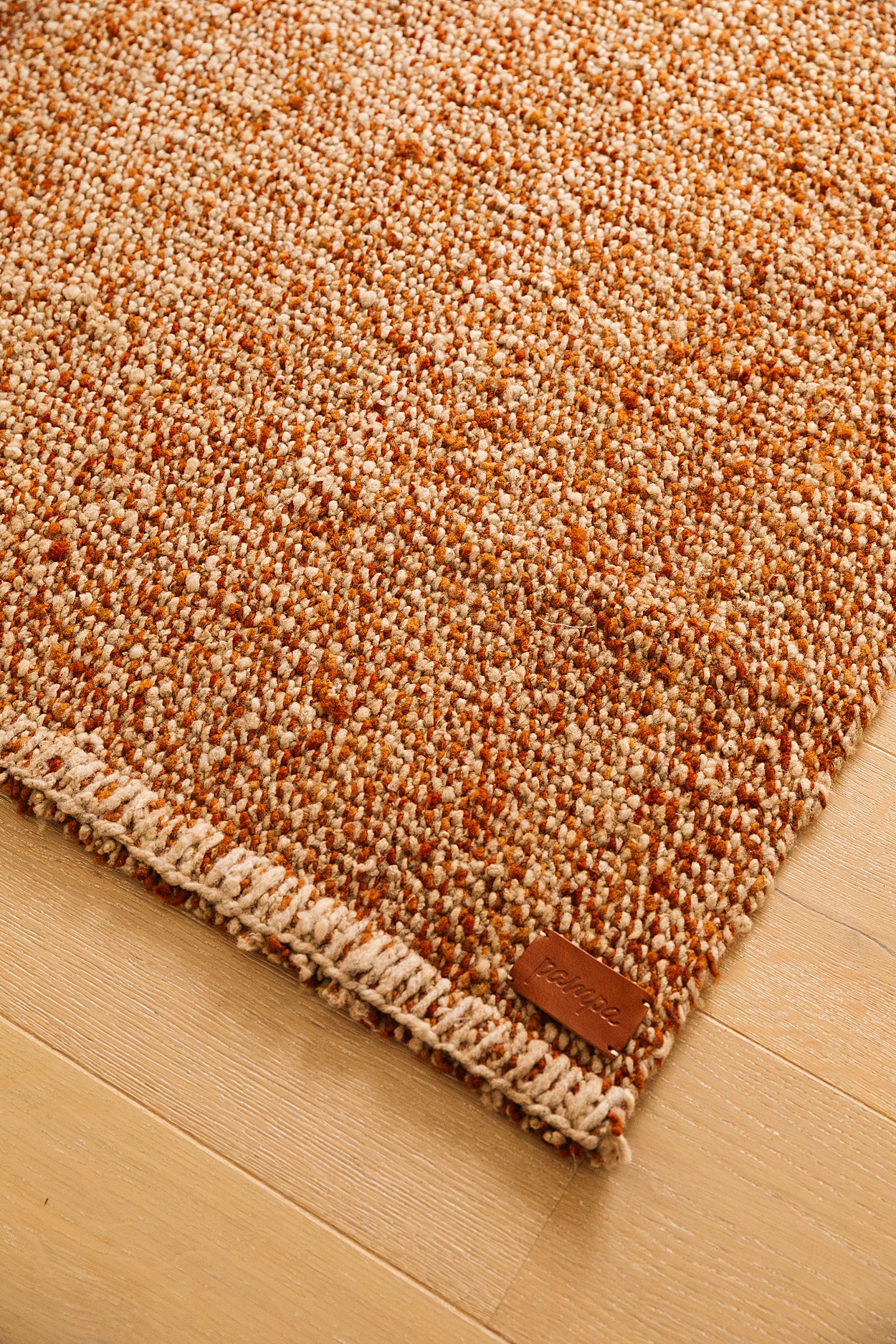
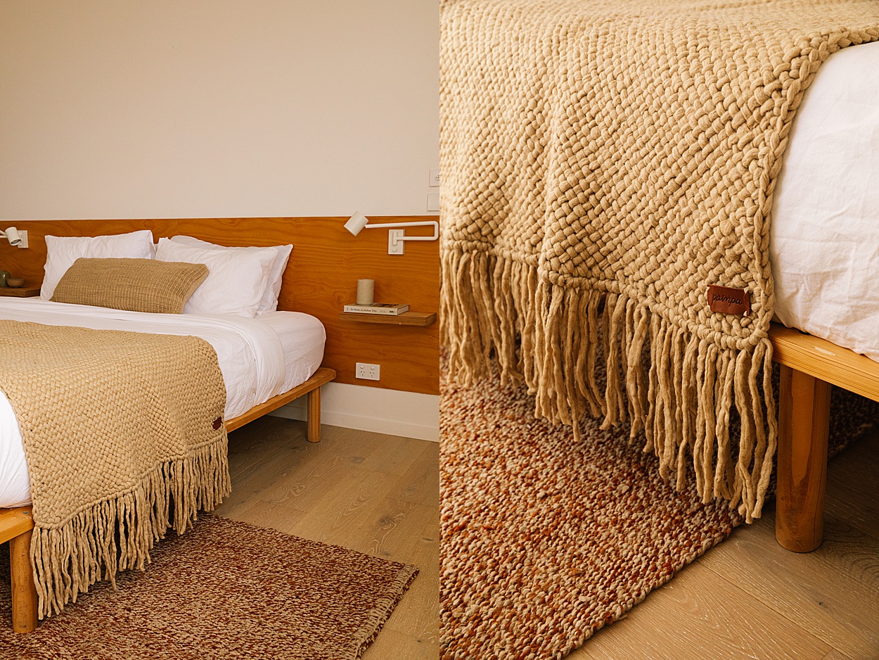
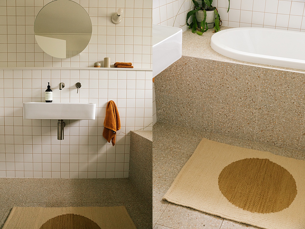
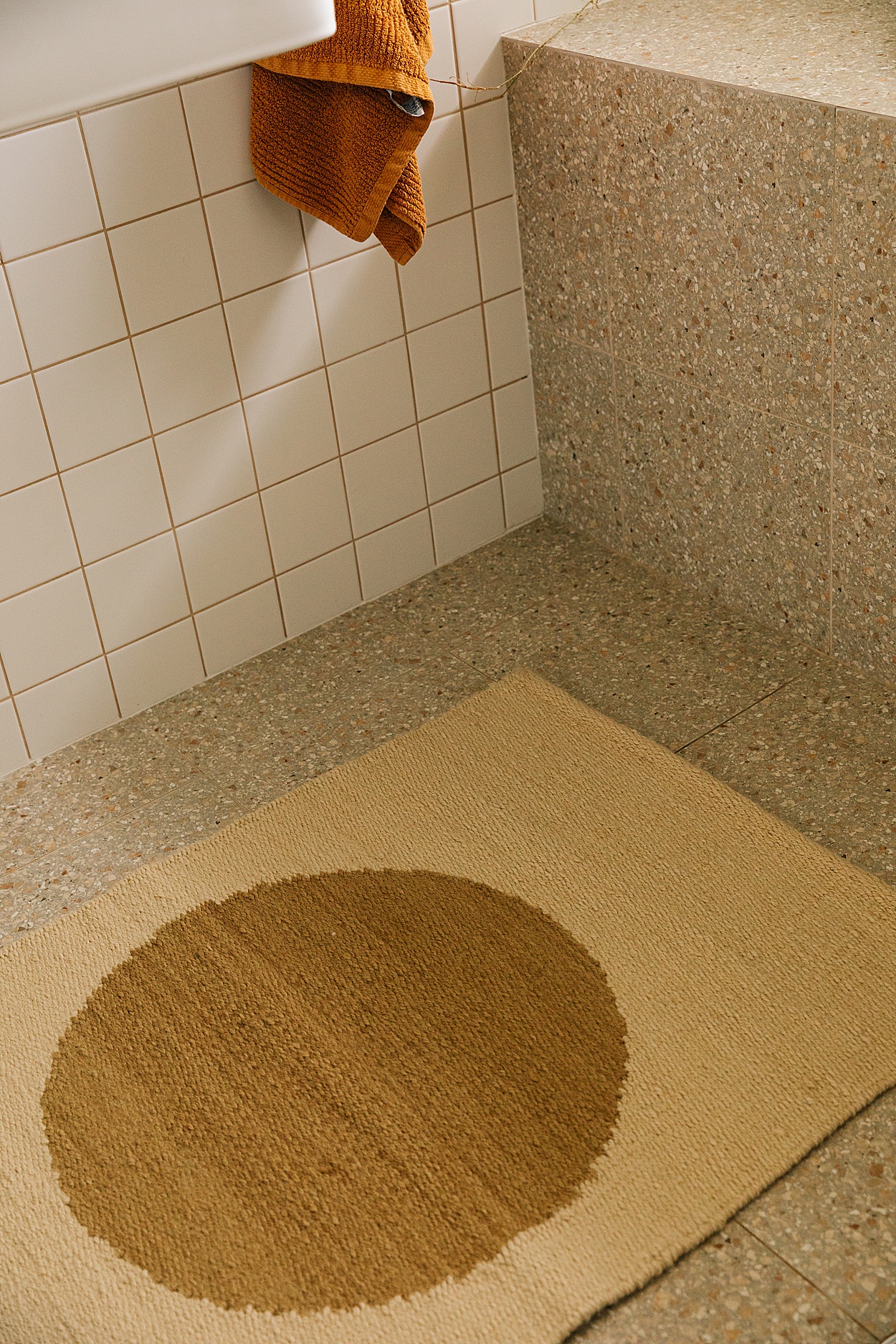
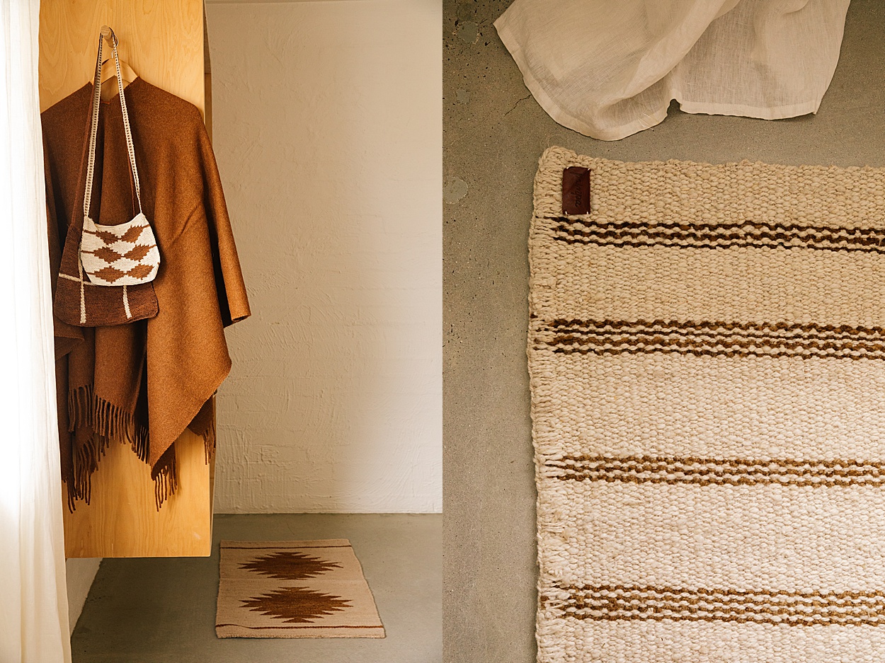
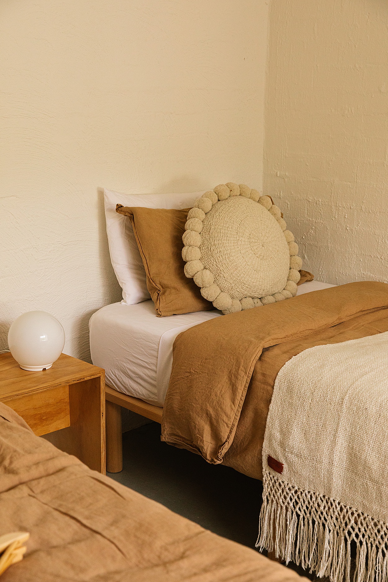
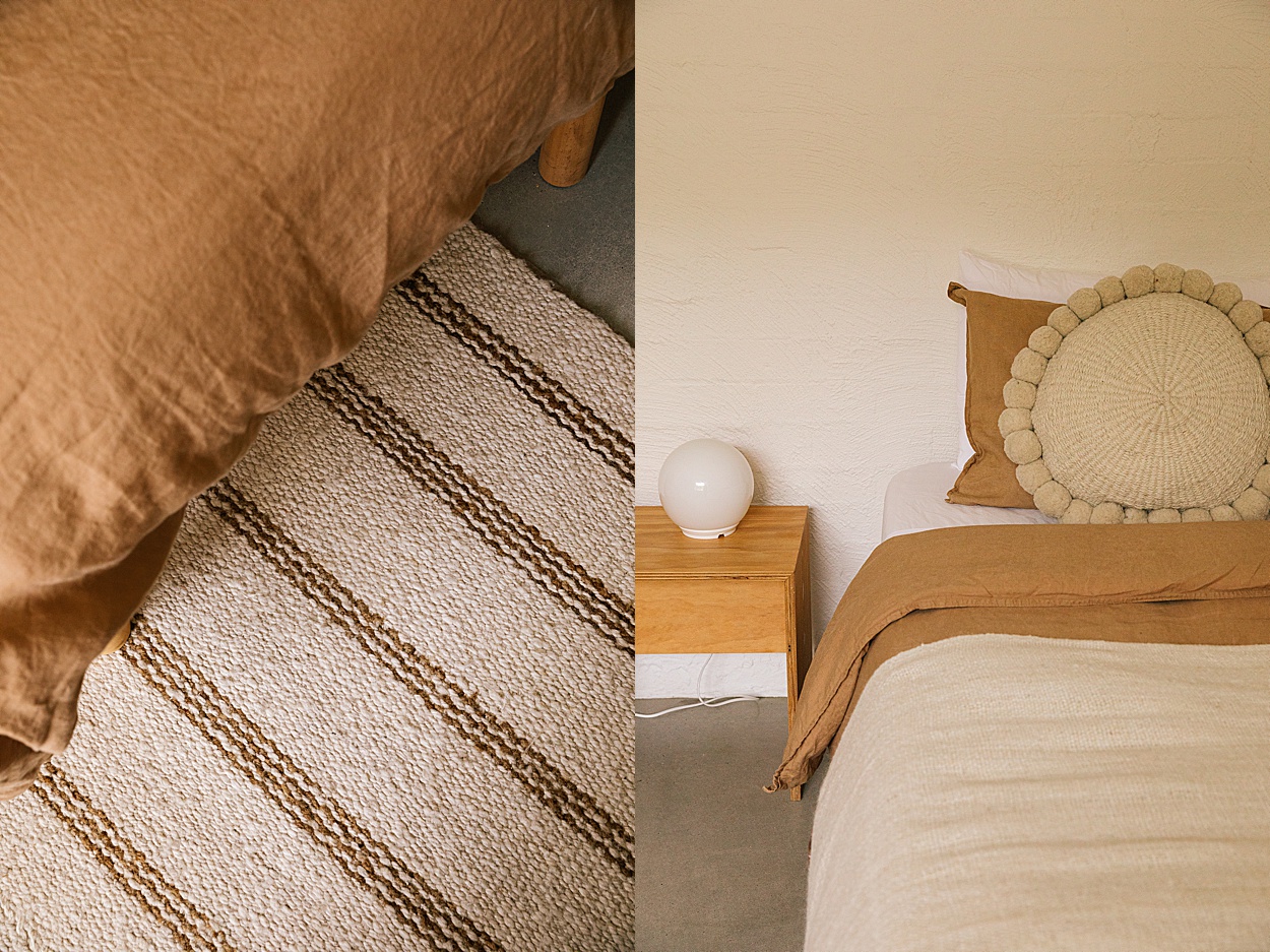
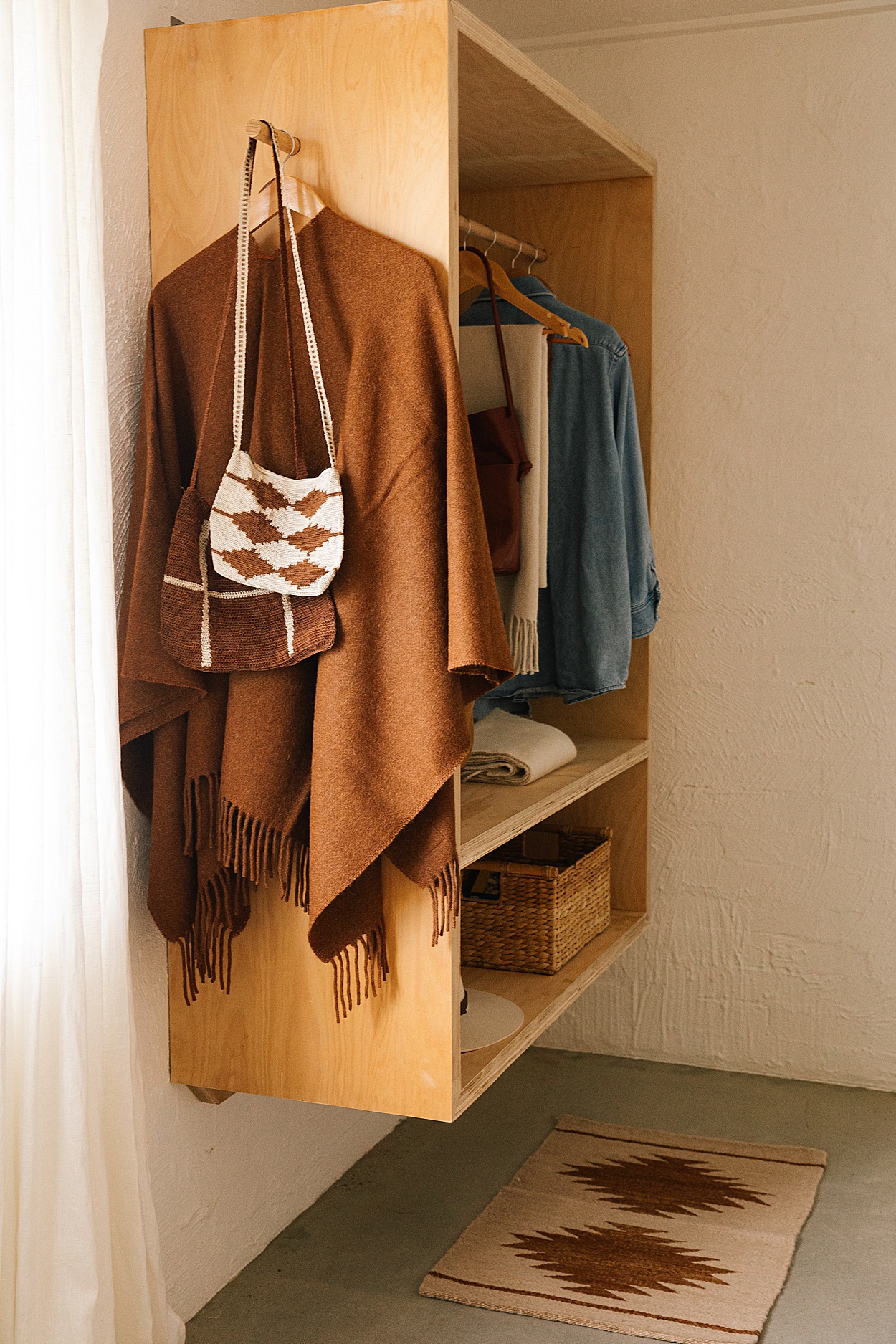
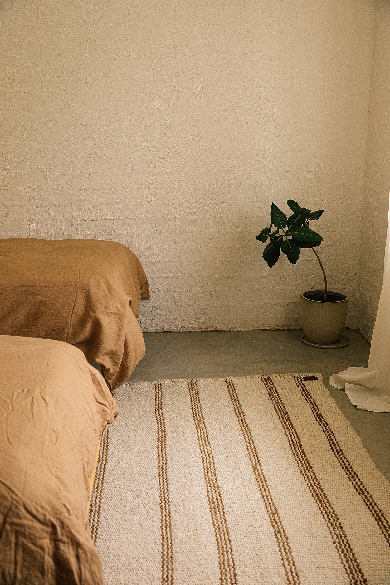
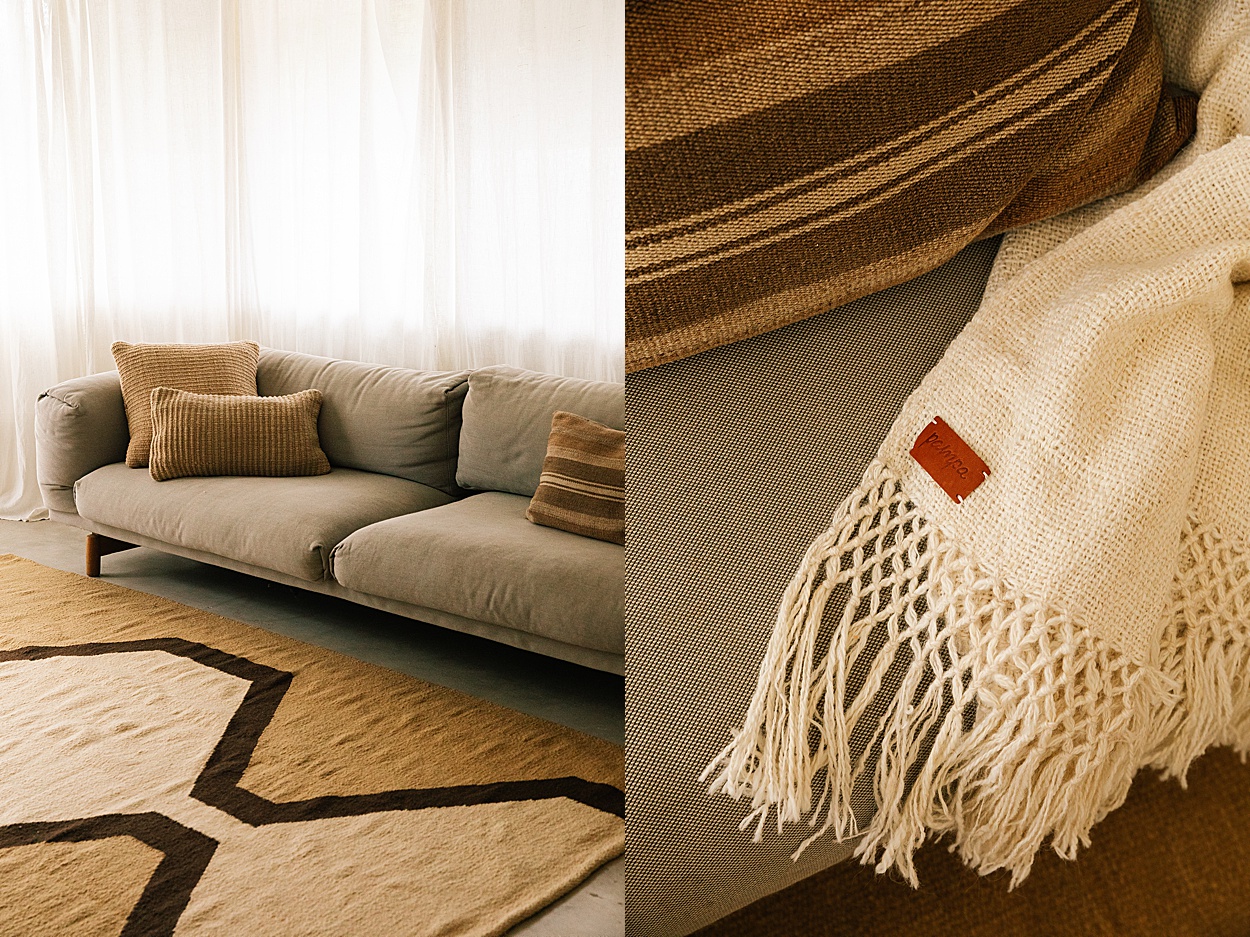
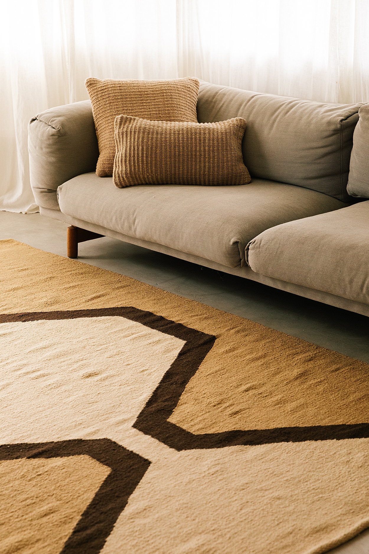
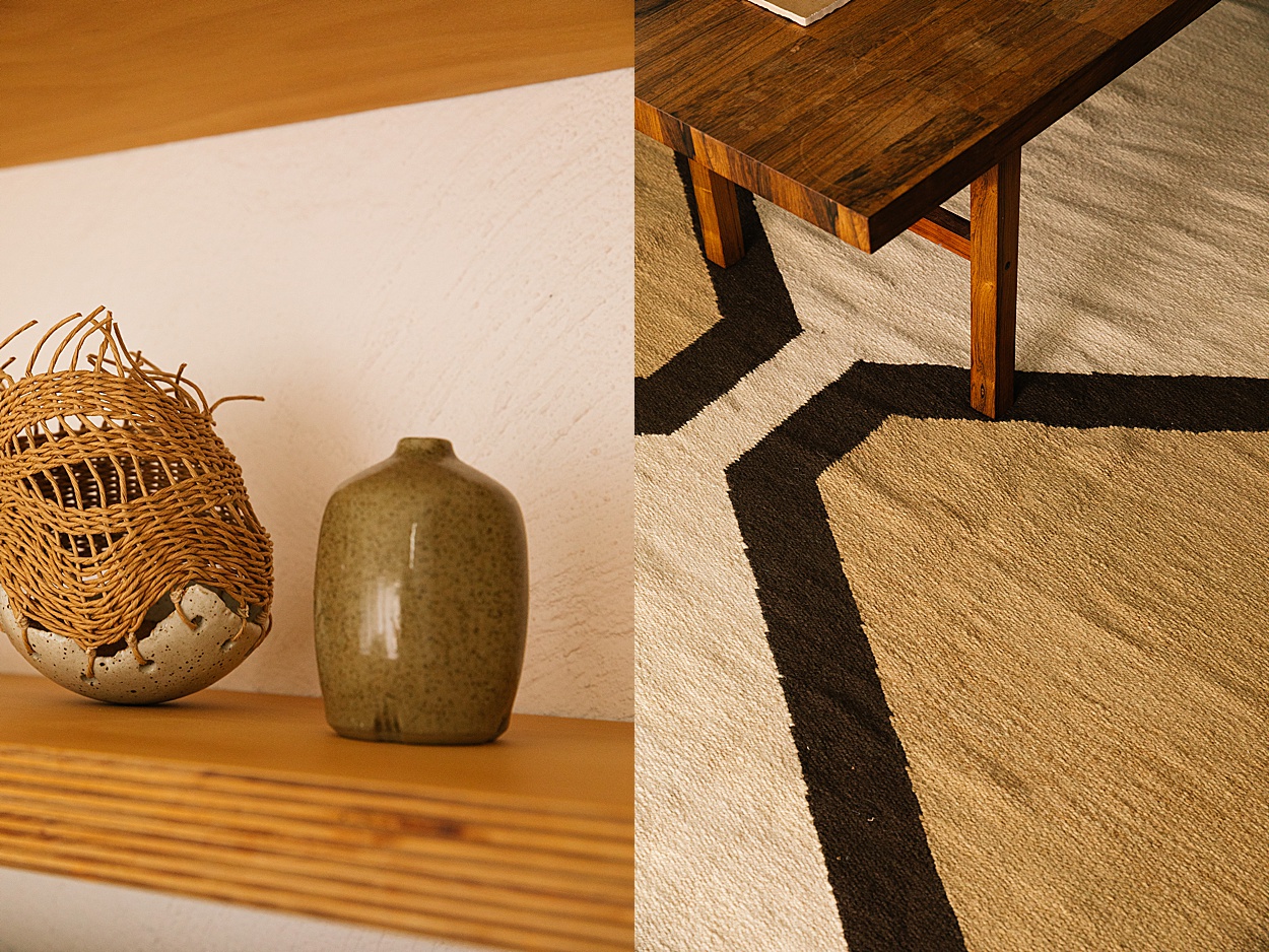
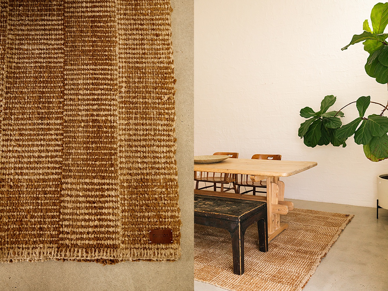
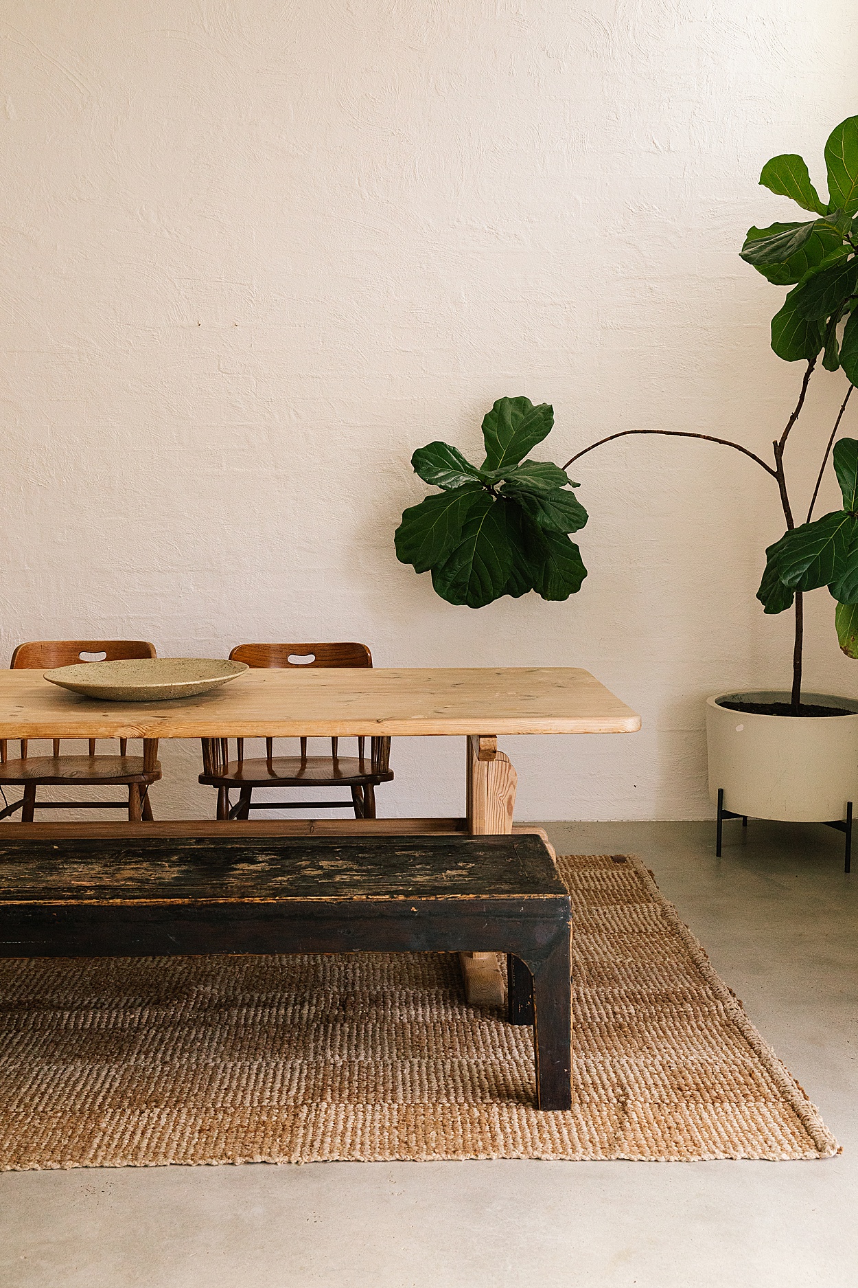
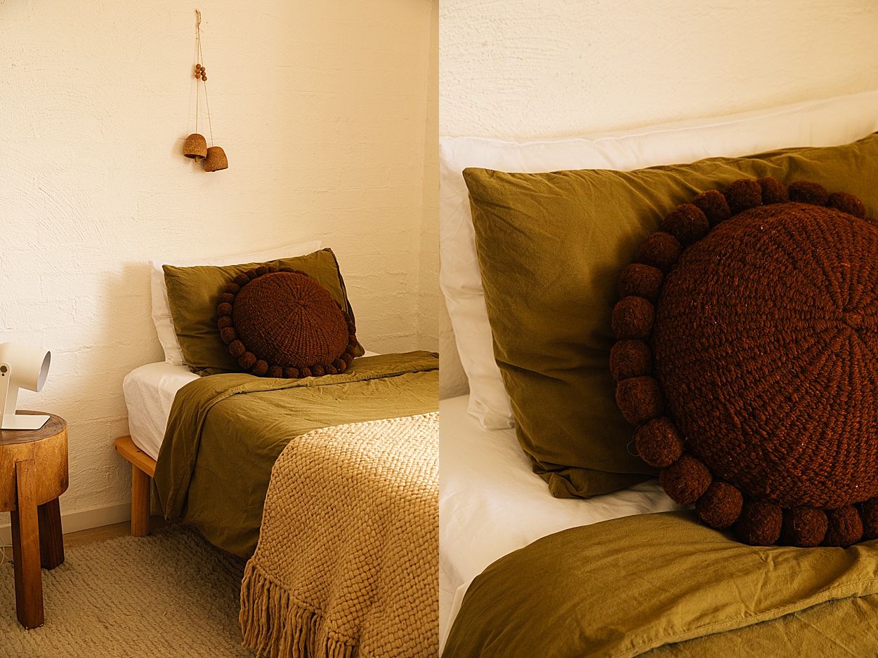
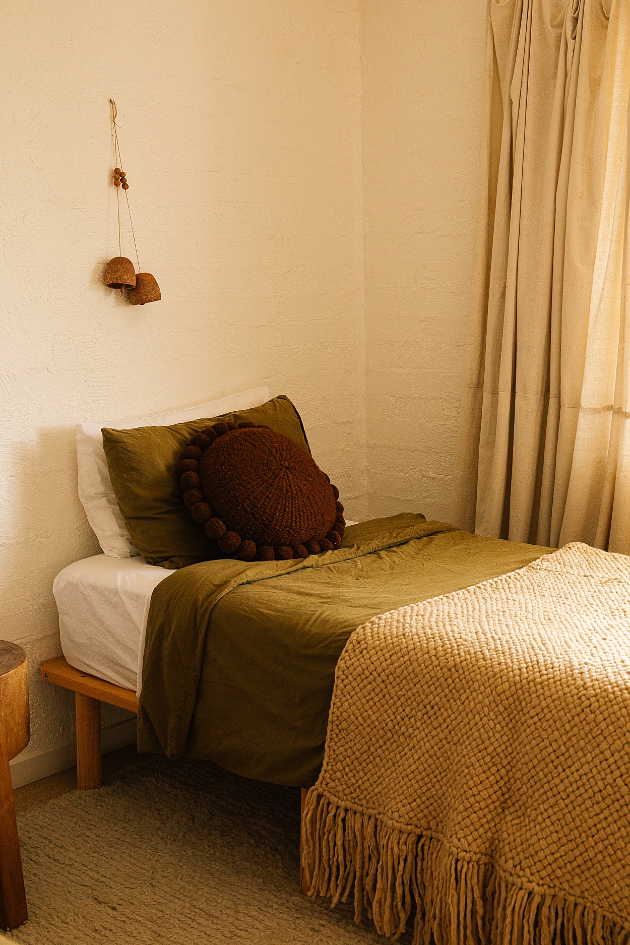
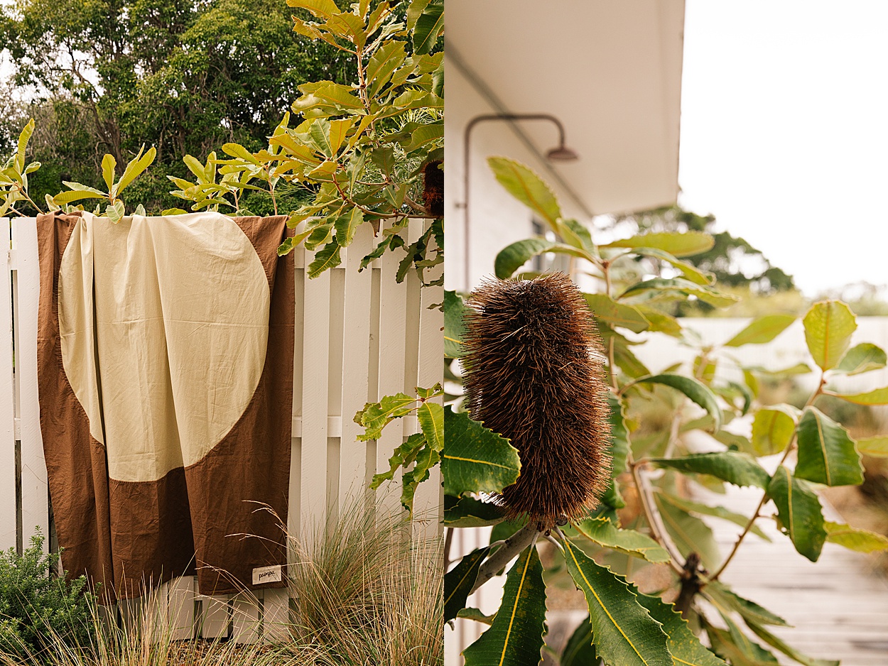
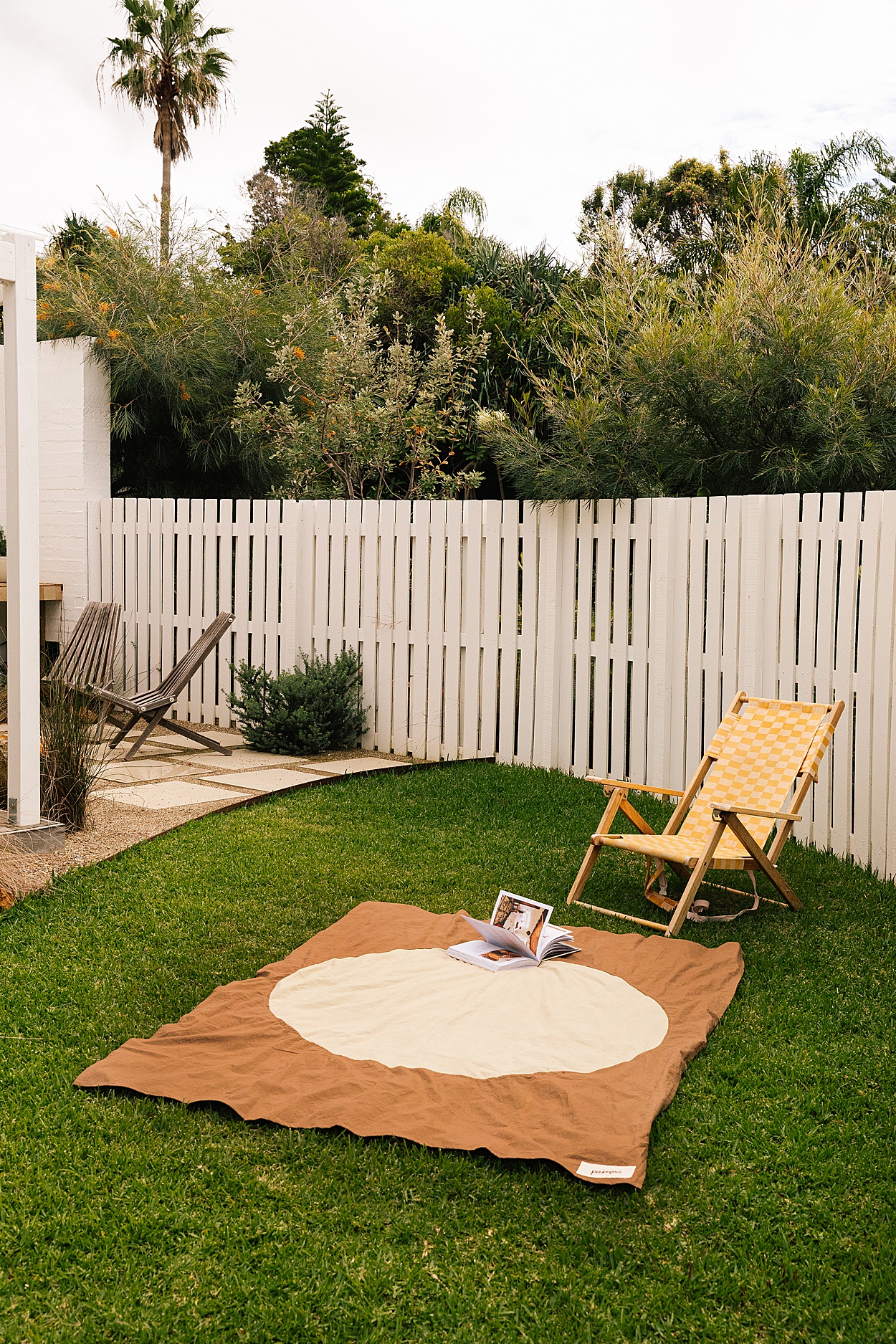
1/ Made-to-Order Antonia Rug 2/ Made-to-Order Lara Rug 3/ Eclipse Throw|Sol 4/ Mini Rug Sol|Bone & Olive 5/ Textural Lumbar Cushion 6/ Made-to-Order Stella Rug 7/Classica #1 Pom Pom Cushion|Rust
Can you share a bit about the inspiration behind The Beach Ranch and how its design reflects the unique blend of Australian and Californian aesthetics?
The design of The Beach Ranch is definitely rooted in what I like to call low-key luxury. Influenced by my time living and working in California, I have found this approach to design really resonates with both Australians and Californians. In a culture where lifestyle takes prominence, the key is finding a balance between having all the things you need and want, and nothing you don’t. All the mod cons you would expect in a luxury property without the pomp. A focus on simplicity and functionality keeps things grounded and investment in materials with customisation elevates a space.
Design elements like natural light, open spaces and natural materials are key to both Australian and Californian aesthetics. I feel that Californian design tends to embrace richer, warmer hues and elements of patina and raw finishes. I find this palette really complements the tones of the Australian bush, creating a harmonious flow between indoor and outdoor spaces. There is also an element of playfulness and diversity about their design style, which I found quite liberating and have since embraced in my approach.
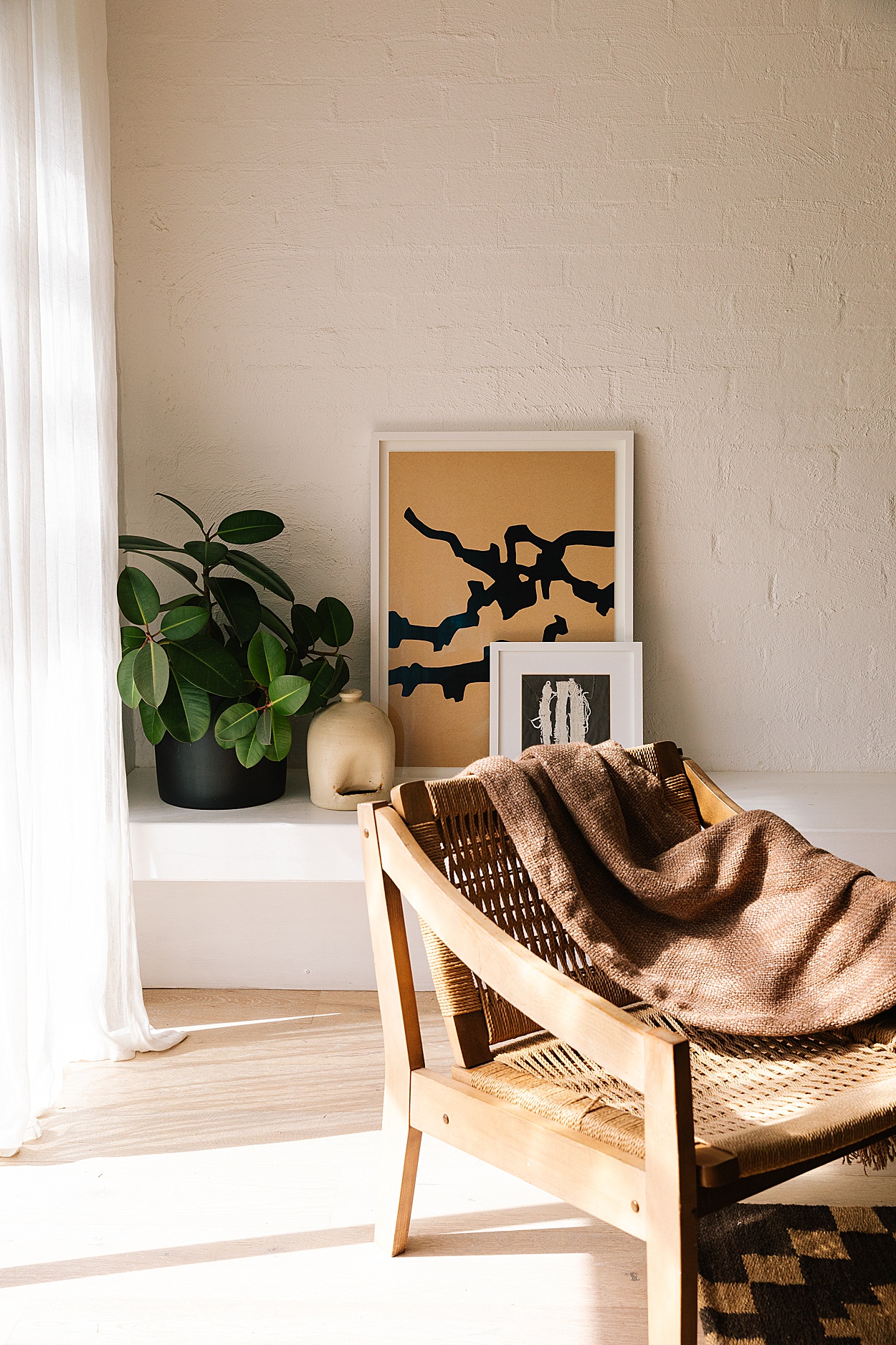
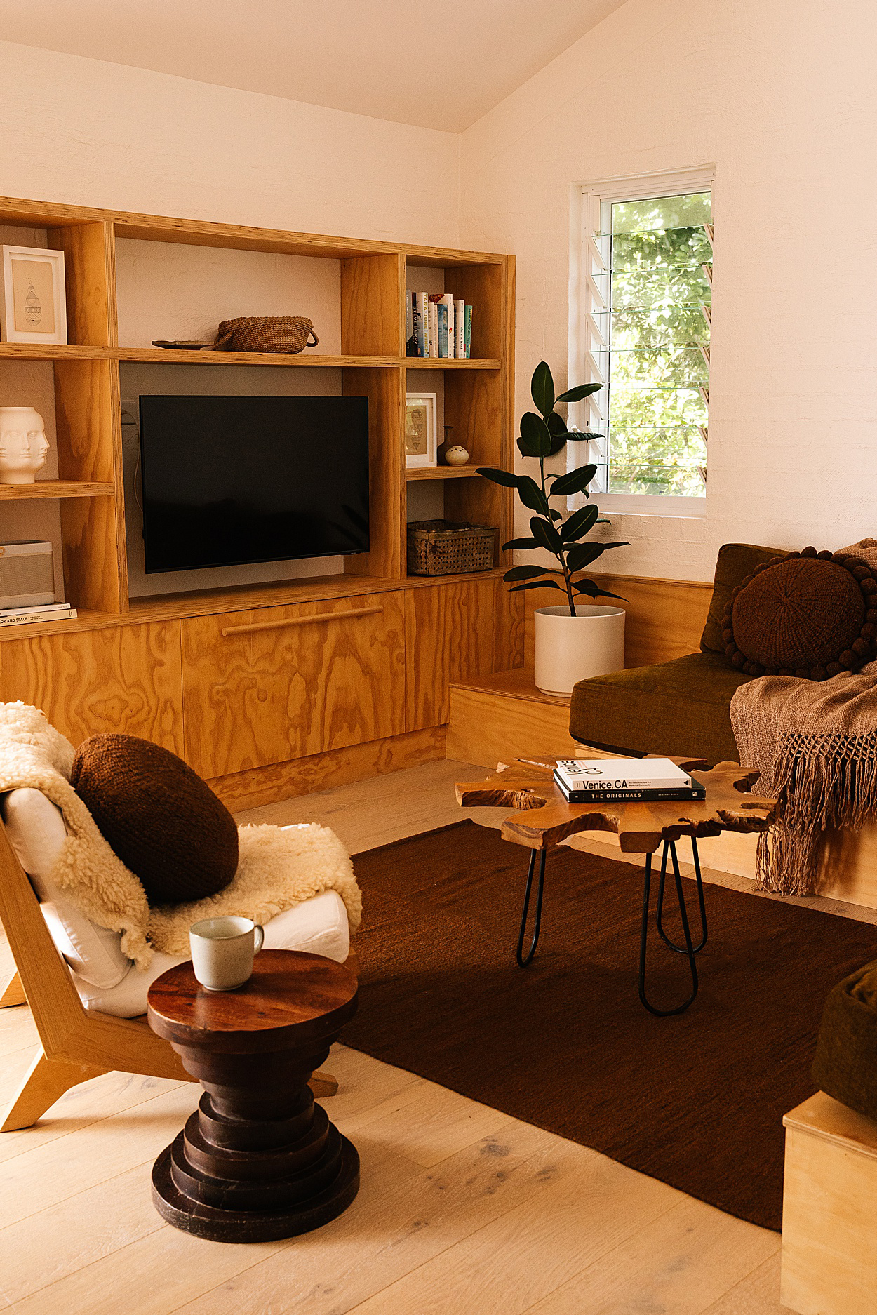
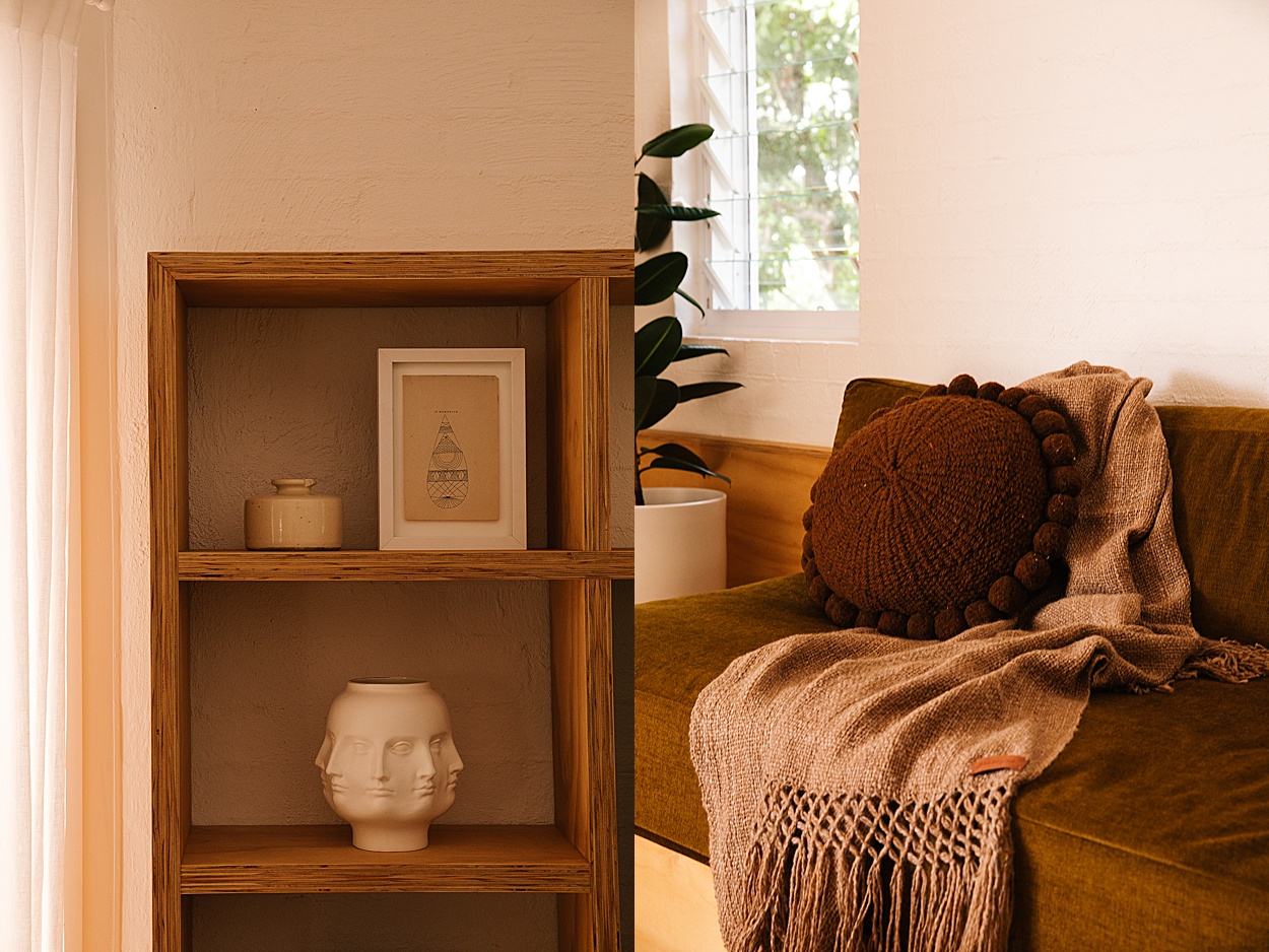
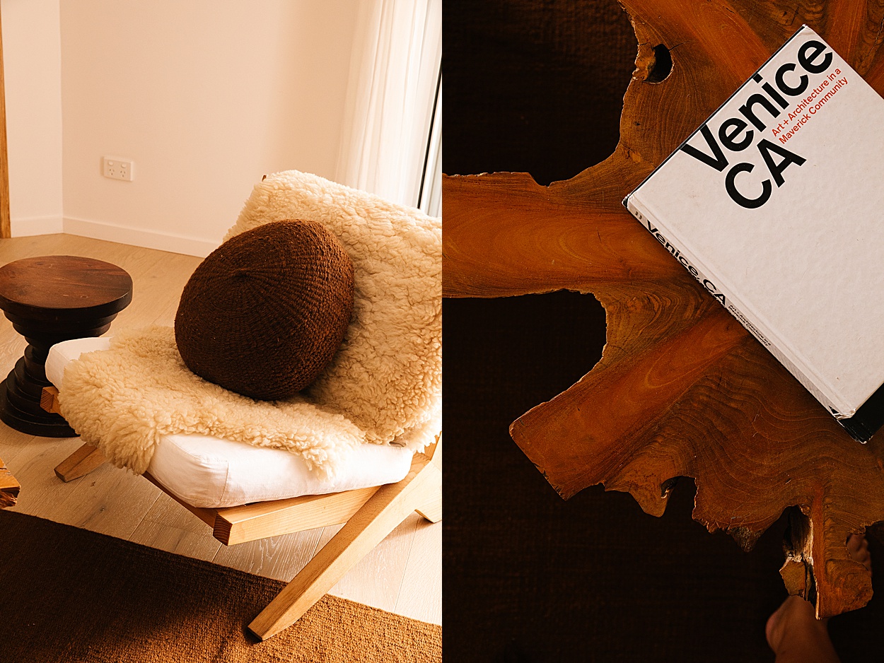
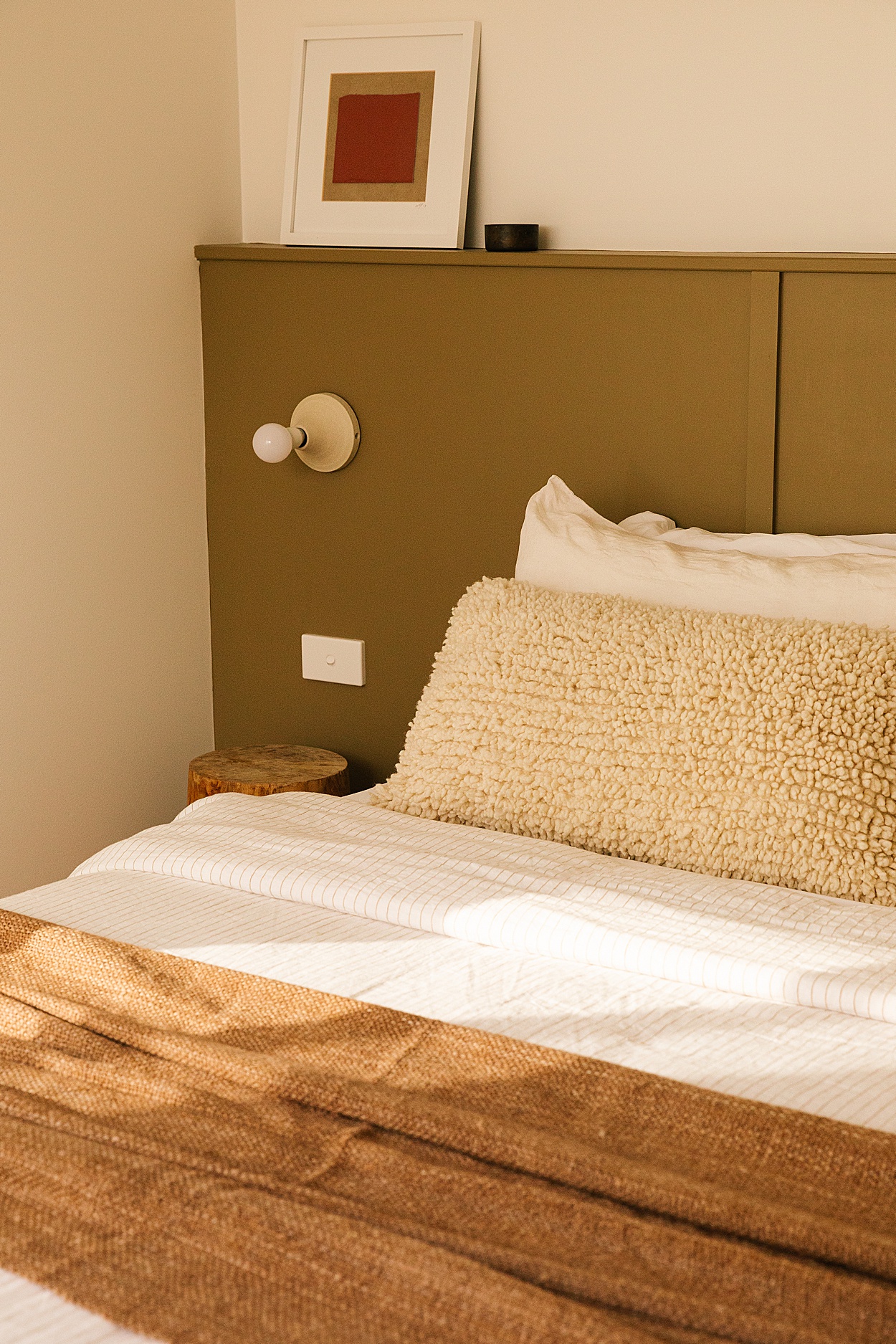
The Beach Ranch is full of vintage pieces I sourced all over the US and brought back in a container, such as mid-century light fittings, ceramics from Long Beach flea markets and unique vintage chairs. There are some unique items I love, like stretcher beds and custom cushions made from 1970s US military canvas.
As an interior designer, how did your personal experiences and background shape the renovation process of The Beach Ranch?
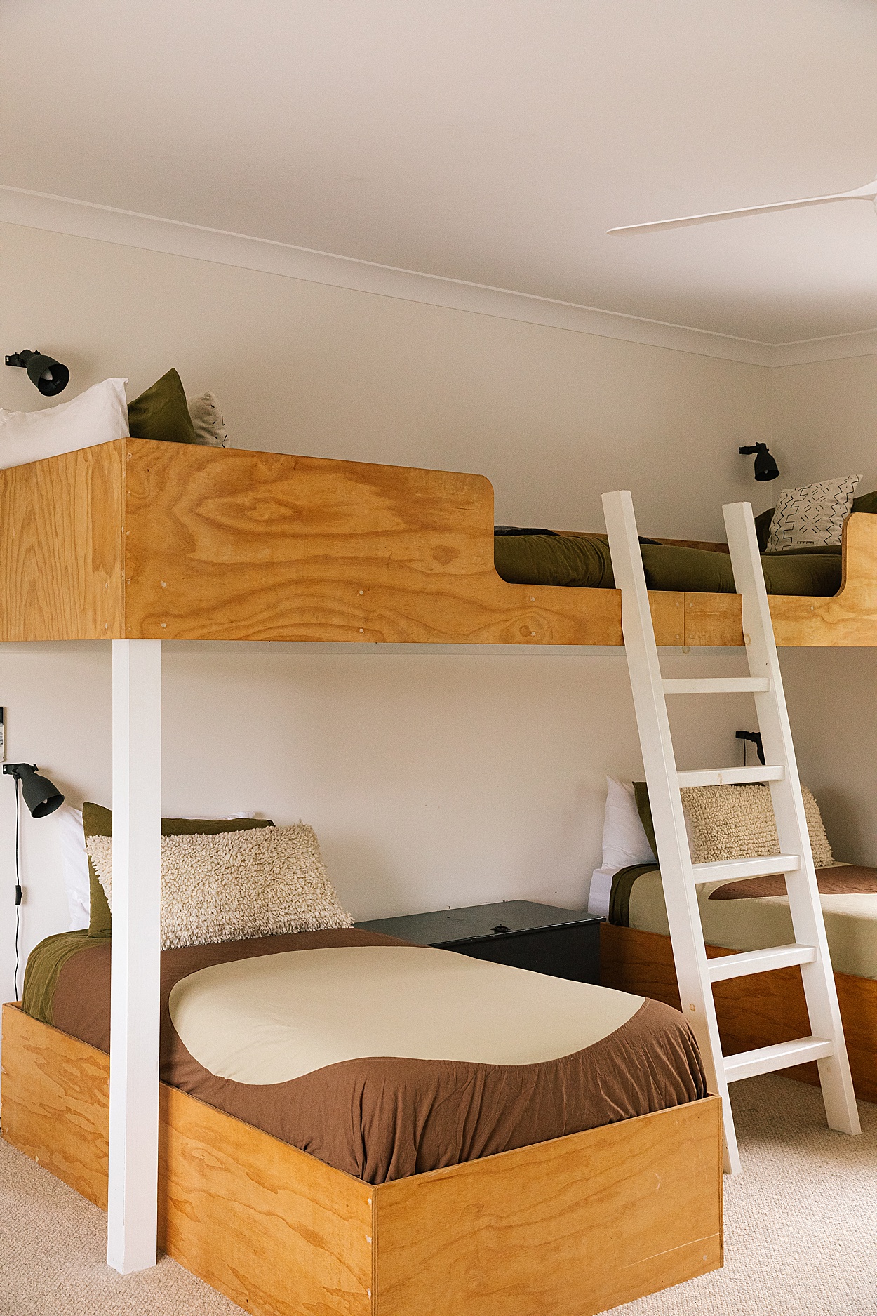
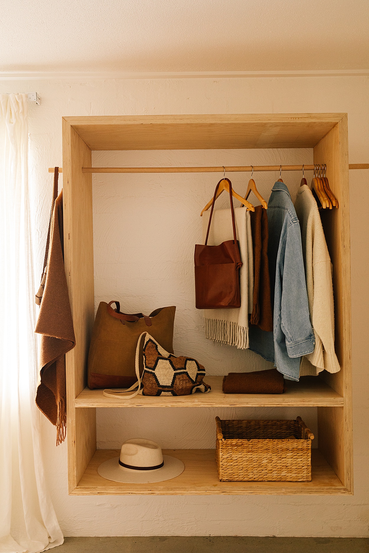
I always like to get granular on how clients and their families use a space and the design brief starts there. For this project, however, I needed to consider both the needs of our varied guests, our cleaning team and also the long-term upkeep and maintenance. Having bought and owned the property with friends a few years before starting the renovations we were able to experience how we want to use the space as well as how our guests do. We learnt that the cleaners had to spend valuable cleaning time rearranging furniture after each group of guests. So when it was time to renovate we needed to build-in as much of the furniture as possible to help alleviate this pressure and cost and to also reduce wear and tear on the property.
I studied hospitality during high school and the French term ‘Mise En Place’ or “putting in place” really stuck with me. The concept of applying a logical organisation to items you use daily to maximize efficiency can really be applied throughout the home. When everything has a designated home and purpose it creates a sense of ease when using the space. Particularly the kitchen. A carefully considered kitchen or laundry can transform mundane tasks into rituals, and a warm and inviting living space can encourage social bonding and genuine human connection.
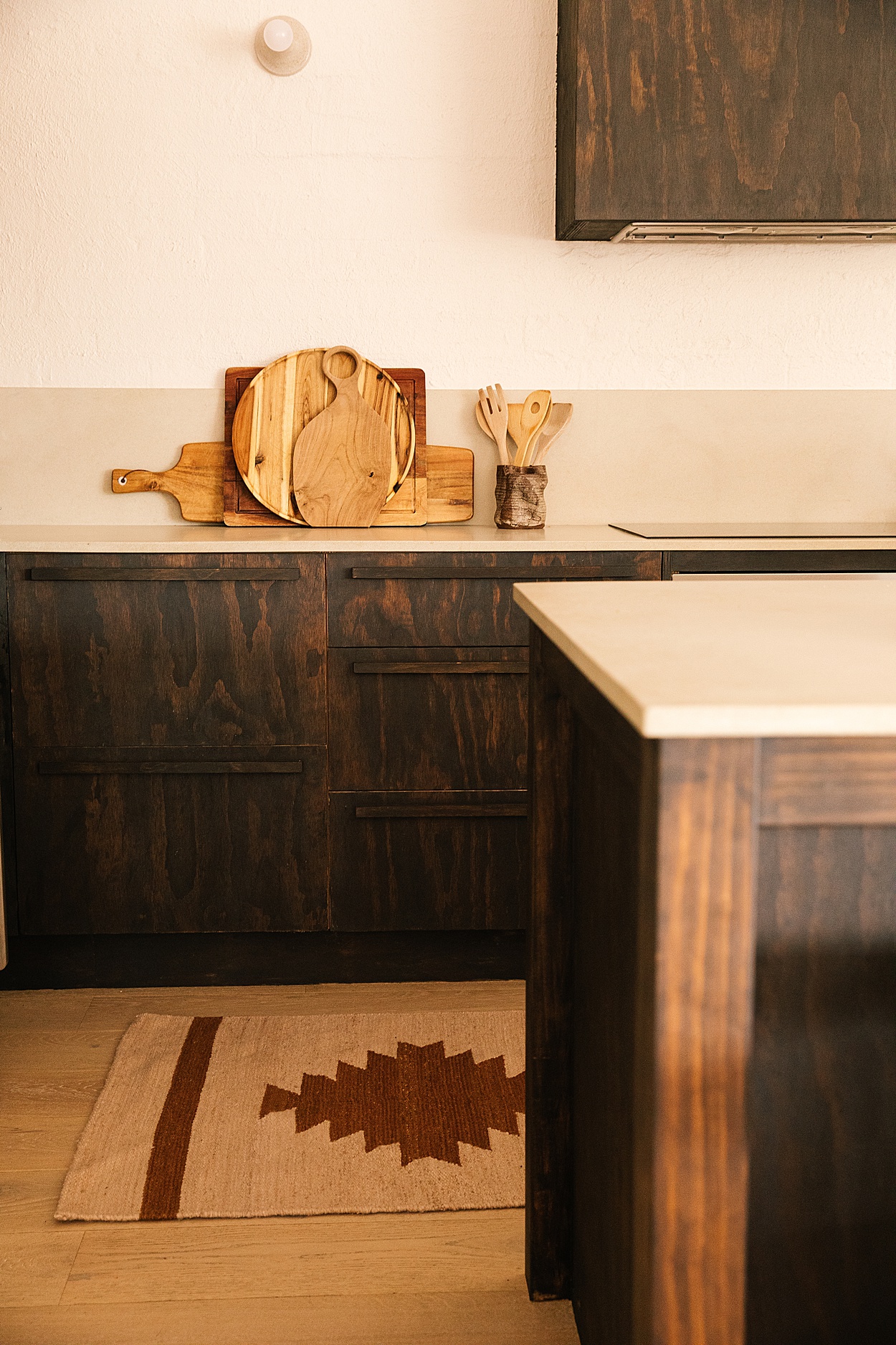
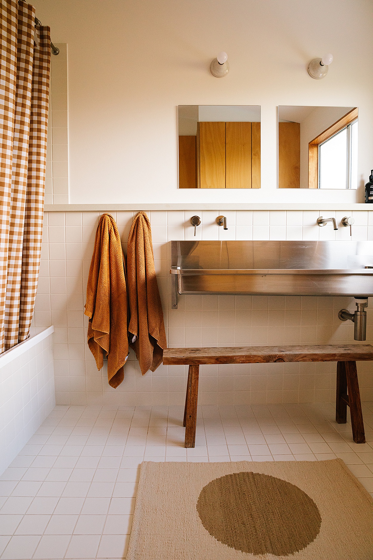
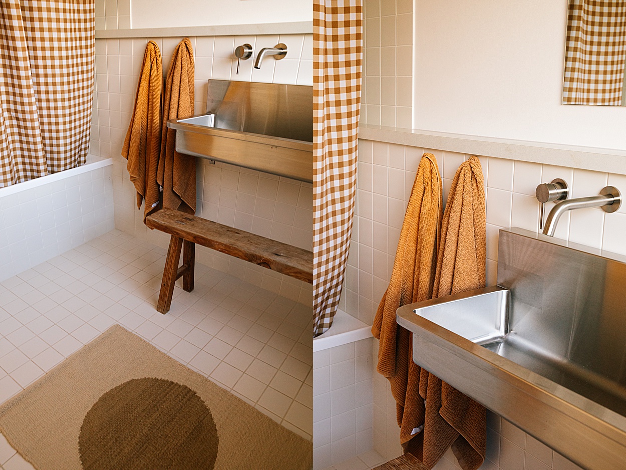
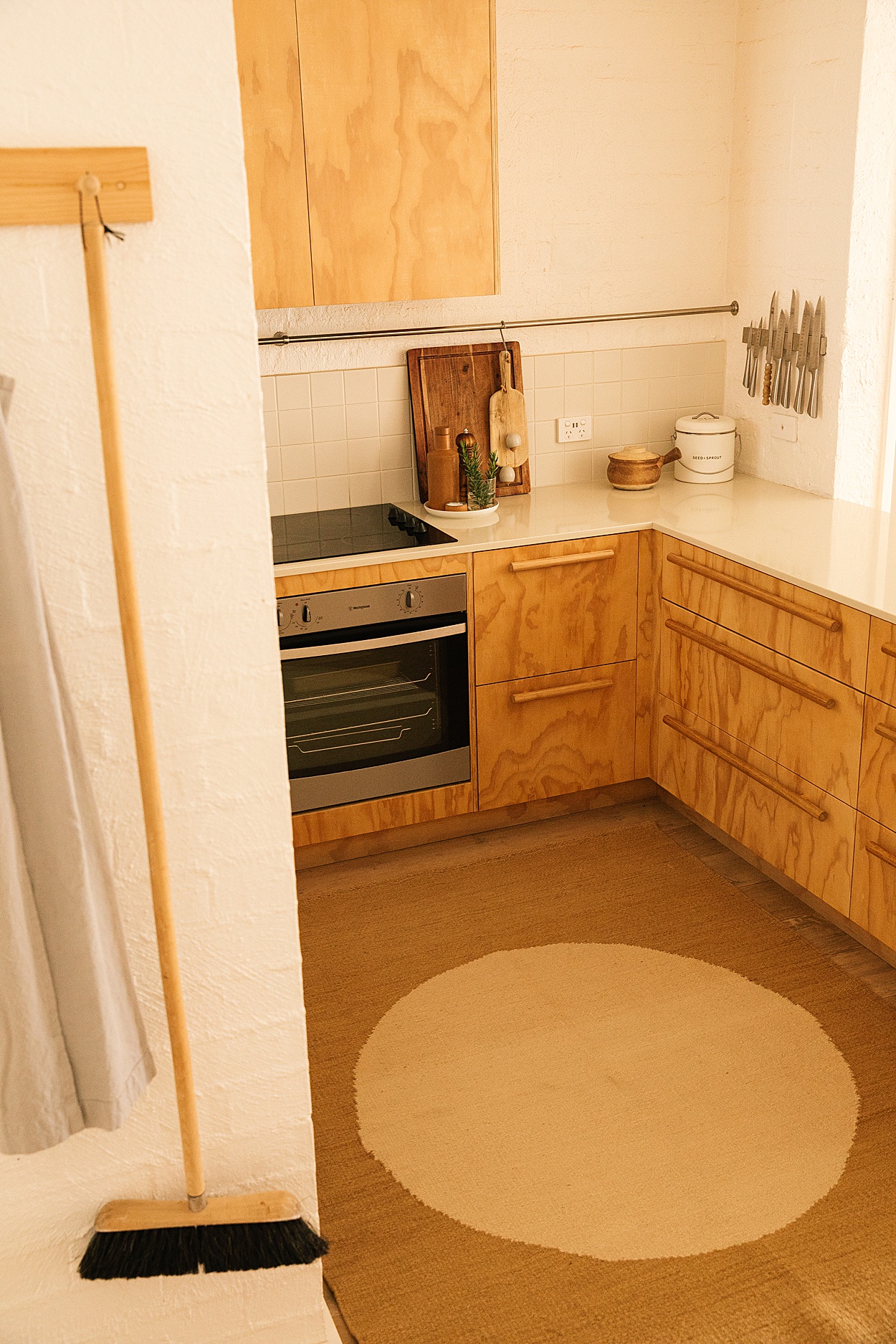
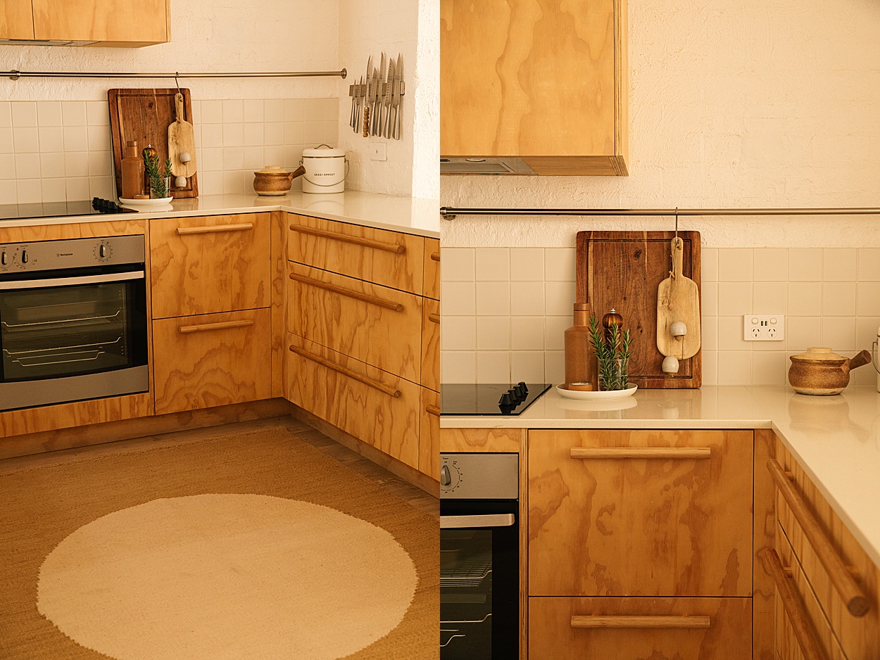
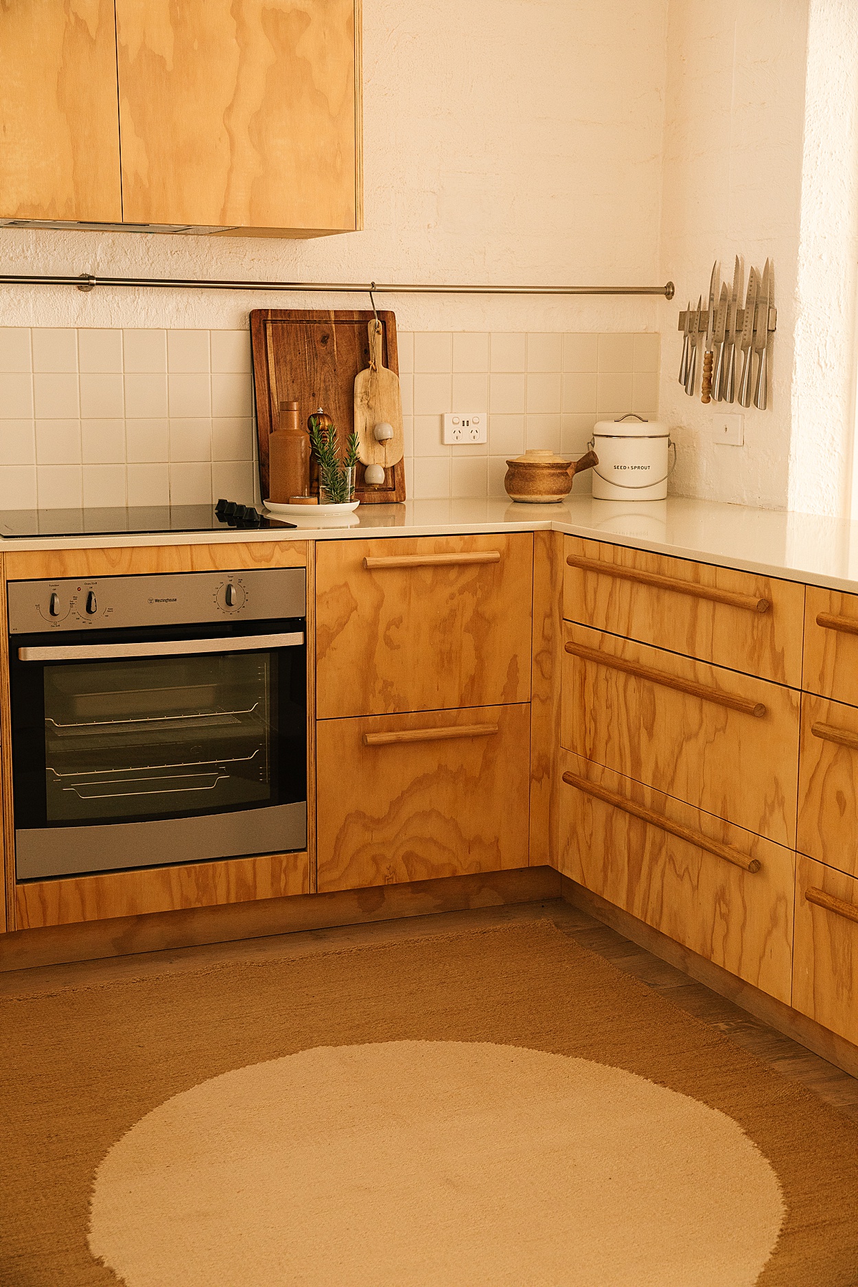
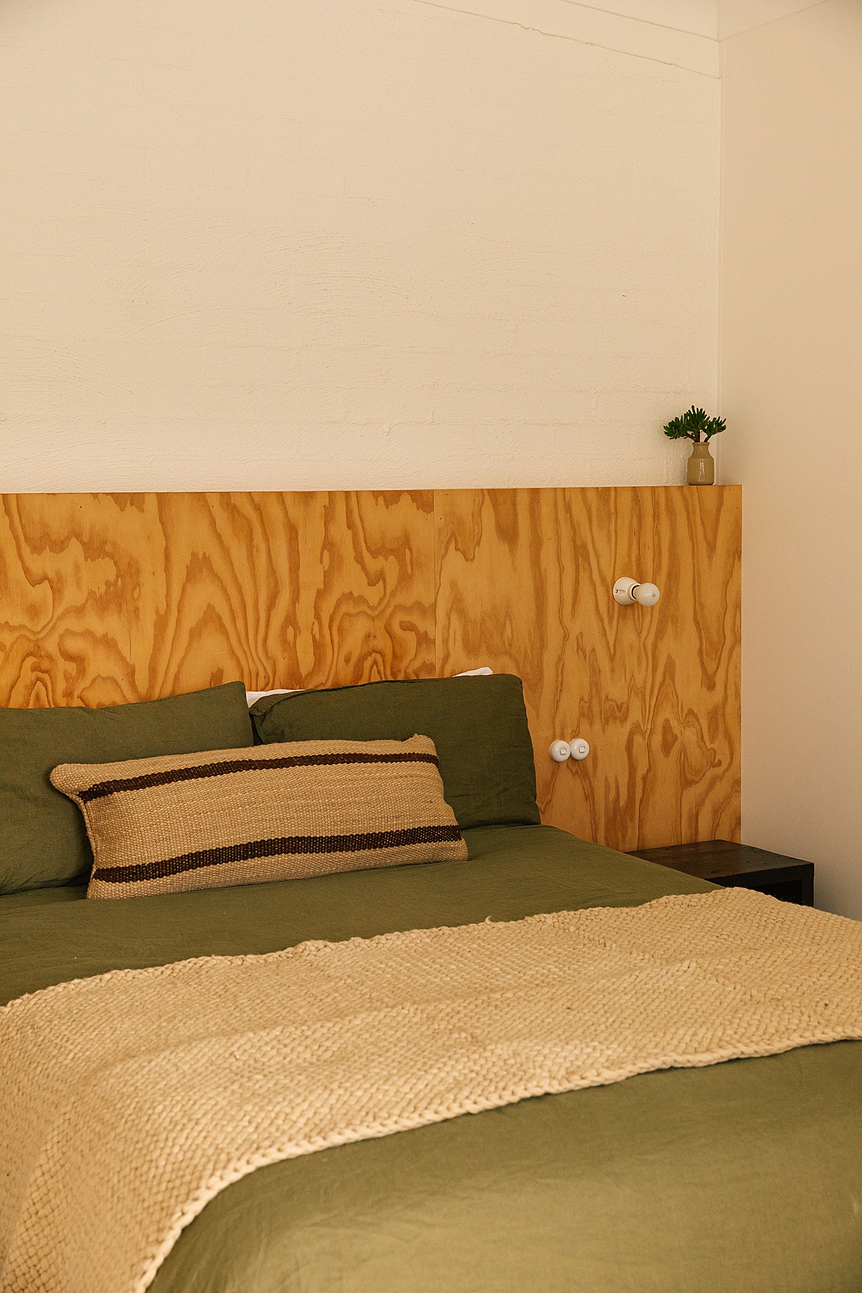
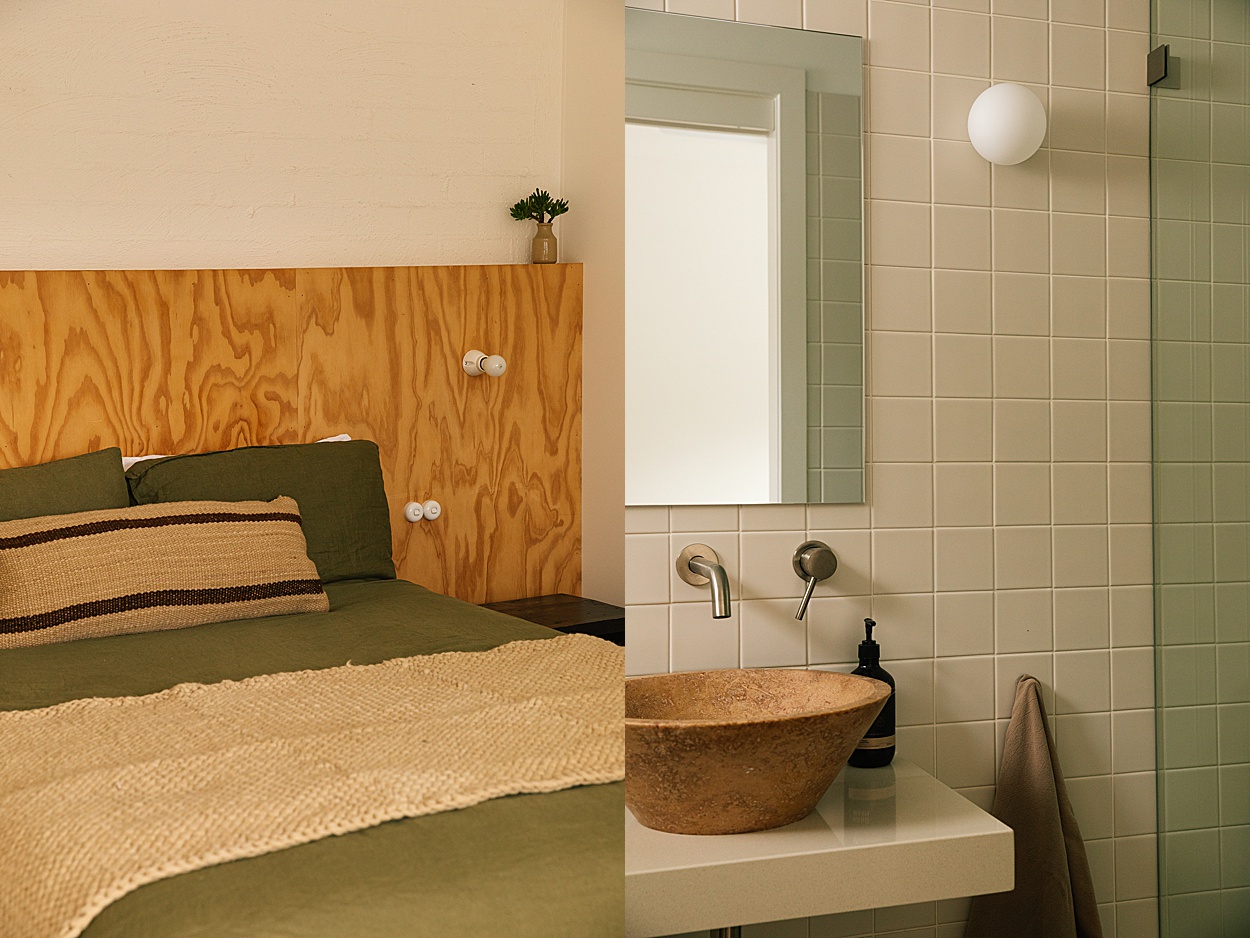
I’m a mum, Airbnb host and designer so I naturally go for materials that are easy to clean, refinish and repair. I love how plywood handles wear and tear and can have different looks over its lifespan. Fixtures and finishes like brushed stainless steel show less fingerprints, are easy to clean and won’t chip like some of the more fashionable black or white coated tapware. Plus, it handles the salt air being so close to the beach. I also used the same materials throughout the properties where possible such as the square wall tiles, stone counters and shelving and paint for efficiency and to minimise wastage.
The Beach Ranch is situated in Angourie, a coastal gem known for its beautiful beaches and laid-back vibe. Can you let us know your recommendations for guests visiting Angourie and Yamba?
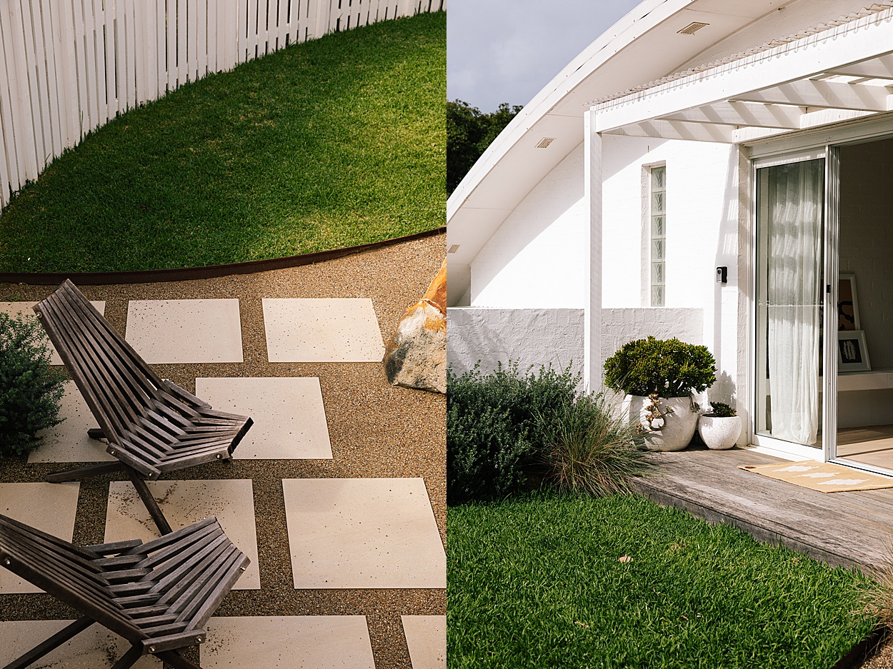
The best thing about staying at Angourie is waking to the cracking whip of the Eastern Whipbird before wandering down to one of our local beaches for a swim or surf before grabbing a coffee from Cafe Angourie. Then home for a hot outdoor shower. We are surrounded by National Park with multiple beach options for any wind condition.
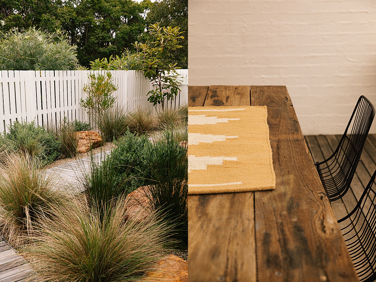
Yamba is only a few minutes away in the car if you want to explore further. A lunch overlooking Main Beach at the Pacific Hotel, a sunset picnic at the Lighthouse or dinner at one of the many amazing local restaurants. If you are staying mid-week we really recommend the local produce market at Whiting Beach which runs every Wednesday morning. Yamba is a fishing town so pick up some local seafood before heading back to Angourie. All apartments have a BBQ and outdoor dining space, so it’s perfect for a cook up.
The Beach Ranch features three units, each with its own distinct charm. Can you walk us through the design concept behind each unit and how they come together to create a cohesive retreat experience?
The building itself was tricky to renovate with internal brick walls and curved raked ceilings. Which meant moving plumbing or electrics near impossible. I love to design within constraints and I feel the challenge produces the most creative outcomes. The neutrality of the flooring, wall colours and tiles added to the simplicity and longevity of the spaces as we chose not to follow any particular trend and we can keep the space evolving in the future.
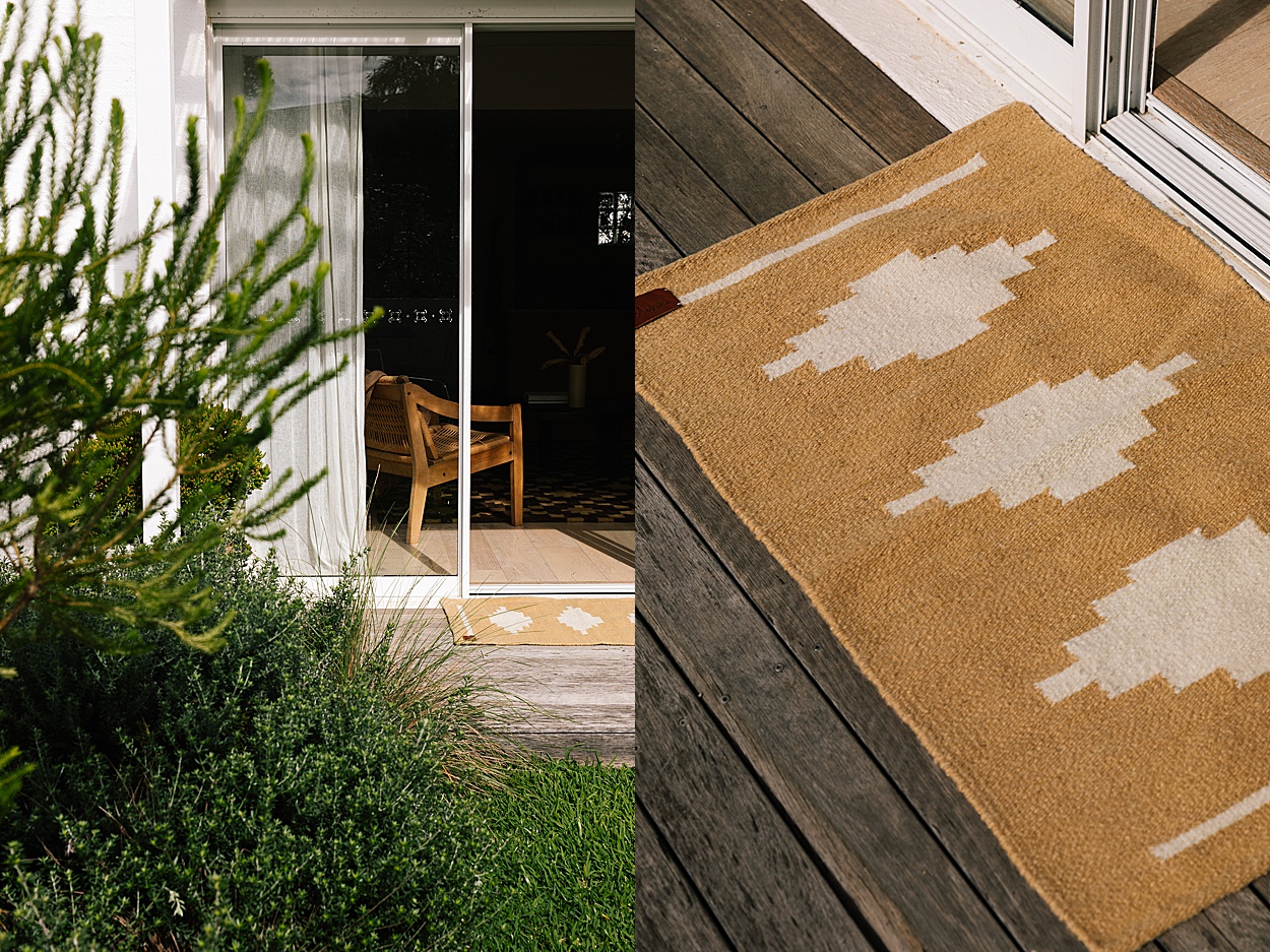
The Garden apartment is the smallest in scale and has an almost Japanese charm to it with it’s light plywood kitchen, textured brick walls and minimal styling. It’s most popular for couples and young families. The Pool House is more playful and meant for multiple or intergenerational families with a cosy family room with lush velvet built-in seating, an oversized bunk-come-rumpus-room upstairs and built in dining space meant for shared meals. Carpets upstairs are soft and squishy and the oversized stainless school-style wall sink in the family bathroom makes the space fun and practical for multiple kids. The pool and basketball ring are always a big drawcard for families. The Corner apartment is really popular with couples and families with slightly older kids. The bedrooms are on a separate floors with their own bathrooms and the native garden, deck and BBQ area are definitely a highlight.
Although they all have their distinct charm, they all have a similar handwriting throughout with materials like plywood, khaki canvas, organic timbers, leathers and linens that creates a sense of cohesion and ensures each space speaks to the other.
How do you infuse elements of vintage furniture, unique light fixtures, and natural materials like plywood and tiles to create a welcoming and stylish environment for guests at The Beach Ranch?
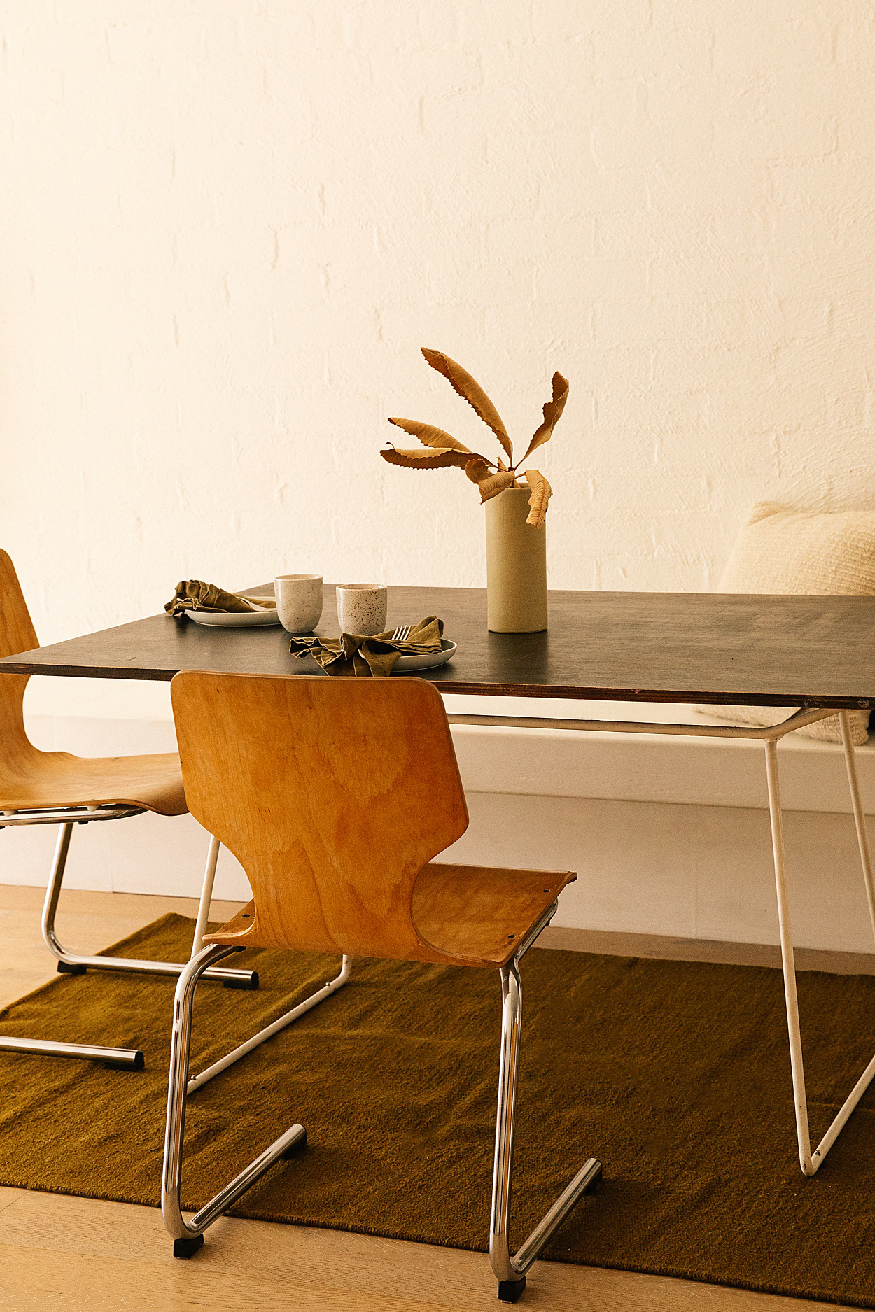
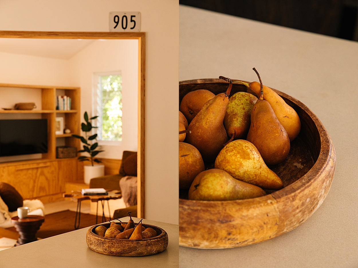
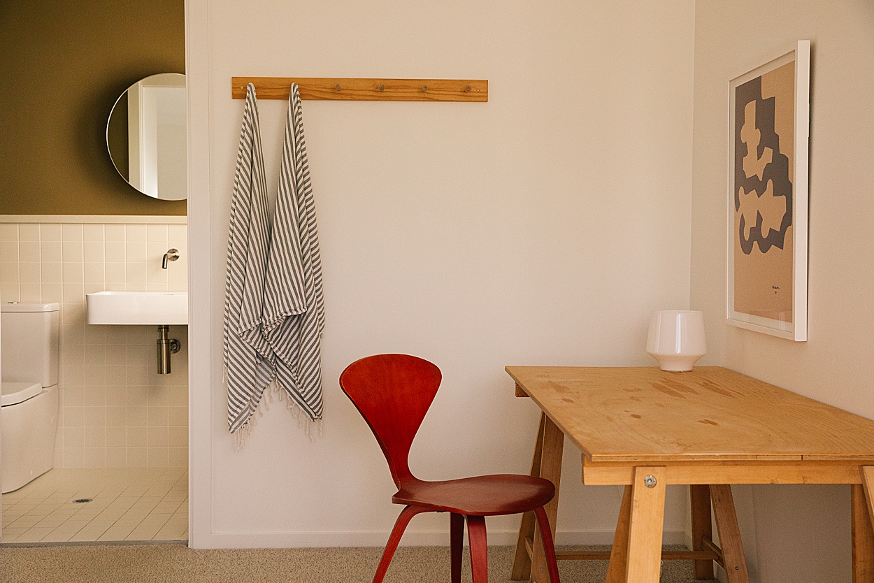
Using a mix of vintage and new, handmade and bespoke, alongside the simple and rudimentary creates a space that has depth and warmth. That feels inspiring without being pretentious. I think people feel welcome when they can relate and relax. Where we might have put some art, a vintage wall light can add sculptural interest, as well as adding cosy and functional lighting options. Vintage furniture and decorative items work really nicely alongside the clean lines and modern feel of our plywood joinery and clean off white walls.
The use of natural materials is prominent in your design. Can you elaborate on why
Another of my key design principles is longevity and legacy. Trying to choose materials for a life in homes that don’t end up in landfills. Solid wood over veneer, plywood in a kitchen rather than melamine or laminate (both inside and out) for example, means these surfaces can be sanded back and refinished if needed. We want our guests to enjoy themselves without feeling like the space is too precious and they can’t relax. It should feel like home. Natural materials like leather and wood only get better with age. Their charm comes from their imperfection. Quality materials do the work, so you don’t have to. There is also a positive time/cost relationship where you might spend a little more at the beginning investing in materiality but less on upkeep and replacements over time.
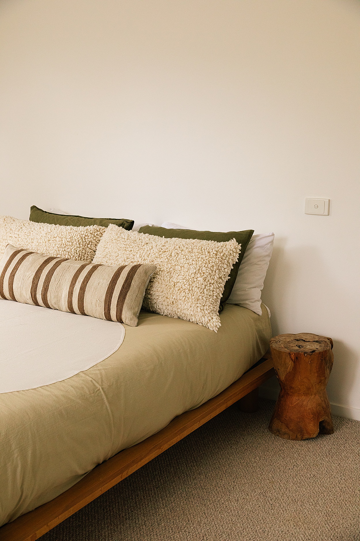
We also have tried to use natural fibres where possible like linen, cotton and wool. Better for our skin and lungs, better for the environment and really, they just feel better to use.
Book your stay at The Beach Ranch here
Photos by Victoria Aguirre

*All images & words are copyright of Pampa, for any kind of use please contact us at hello@pampa.com.au for permission.
Photos Victoria Aguirre



Leave a Comment